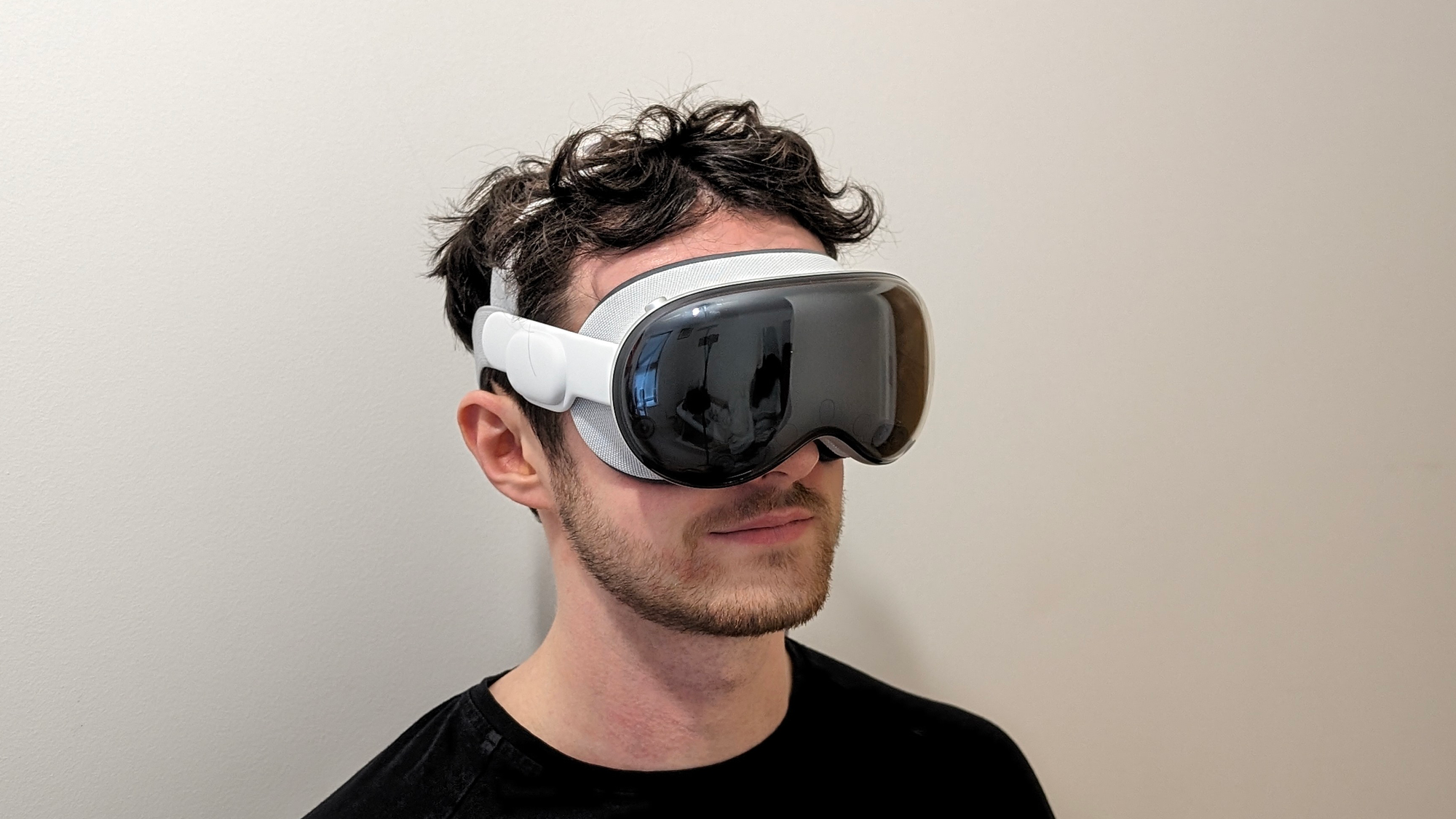
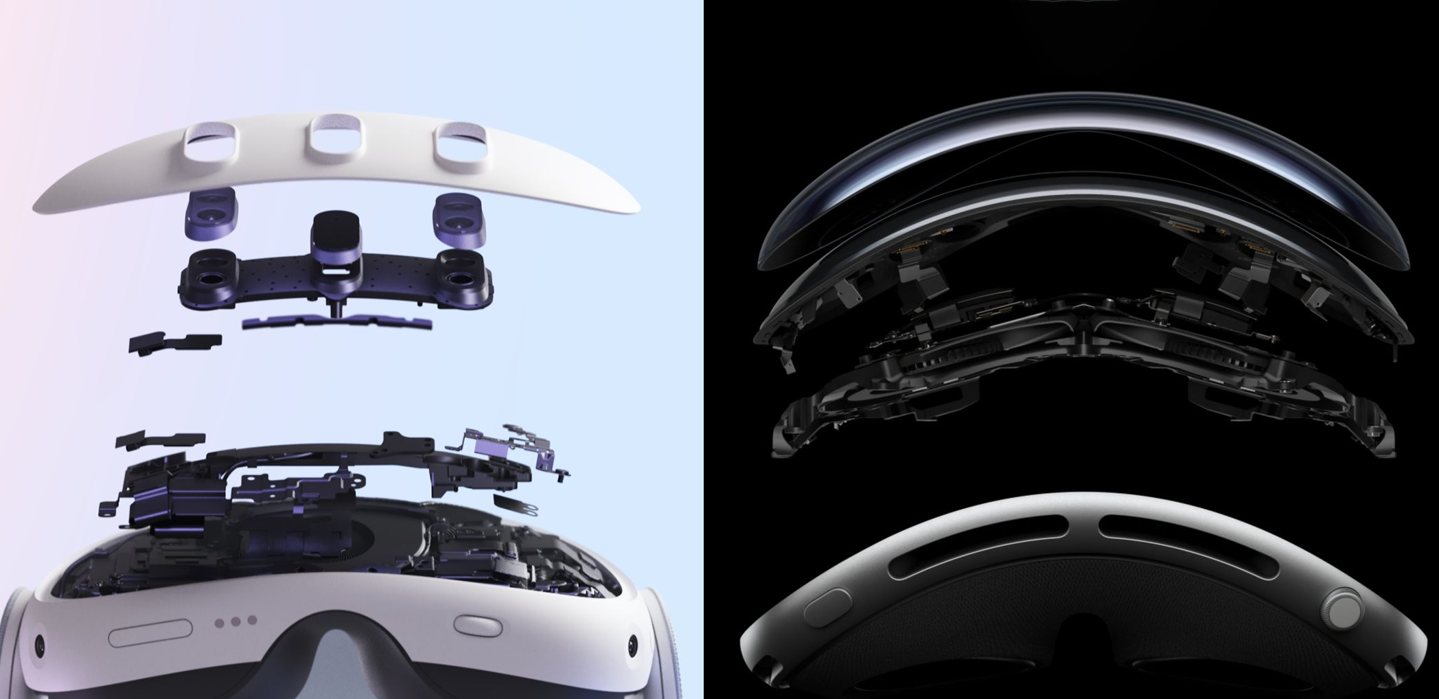
Apple Vision Pro is a very impressive fusion of hardware and software, but it’s by no means perfect. Read on for my breakdown of the Vision Pro hardware and software and the experience they enable.
- That Damn Battery
- Narrow Vertical Field of View & Light Seals
- IPD Adjustment & Lens Clarity
- Passthrough Is A Mixed Bag
- Stunning Near-4K OLED Microdisplays
- Weight & Comfort
- Occlusion & Boundaries
- visionOS & The Shared Space
- Input & Controls
- Digital Crown & Environments
- EyeSight…
- Optimization & Performance
- Guest Mode & Sharability
- Movies & TV Shows
- iPad Apps
- ‘Spatial Computing’ & Mac Integration
- Gaming
- Apple Immersive Video
- Spatial Videos
- Personas & FaceTime
- Travel Mode
- Conclusion, And Who Exactly Is Vision Pro For?
If you want to read an on-paper specs breakdown of Vision Pro, you can do that here. This review will reference some of those specs, but it is primarily about the actual experience of using the product. And to be clear, I used it in a real home, not a carefully controlled demo environment or a well-lit studio. And Apple did not send UploadVR a review unit, we bought our own.
While I often discuss the long-term potential of AR & VR, in this article I’m reviewing Apple Vision Pro as it stands as a real product today. A product starting at $3500. At that price, Apple is setting huge expectations. But does it deliver? Is Vision Pro really seven times better than Quest 3, or even twice as good? Read on to find out.
That Damn Battery
Arguably the fiercest hardware debate right now in the industry is what to do with the damn battery.
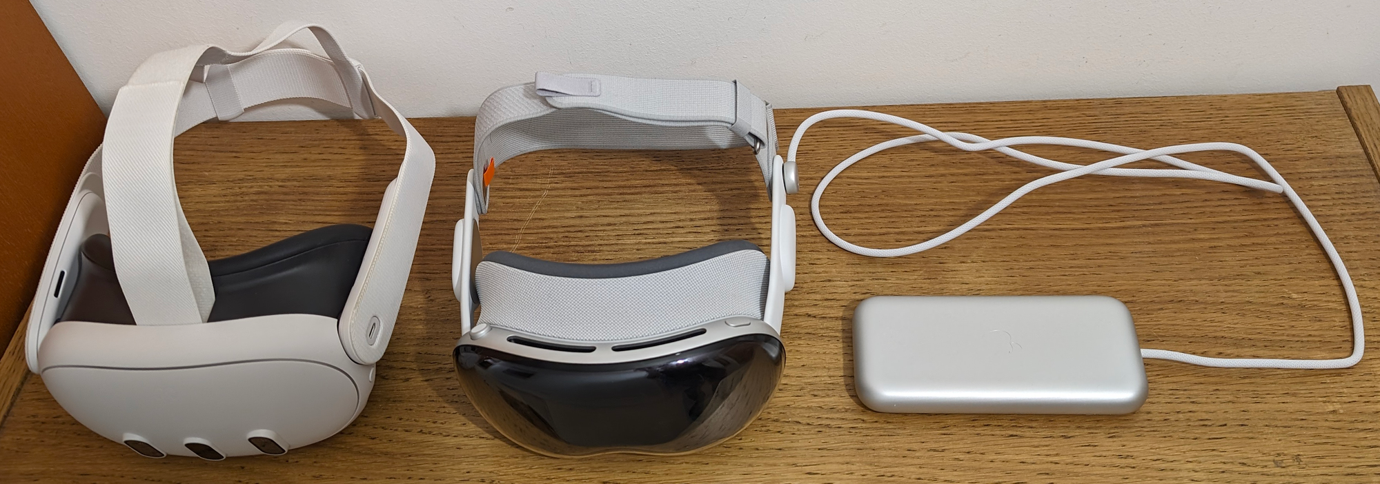
If you keep it in the visor, you increase the weight and limit the computing power envelope to smartphone chipsets. If you put it in the rear padding, you make it impossible to lie back on a chair, sofa, or bed. And if you make the battery external, you introduce an annoying and inelegant tether. All solutions have harsh tradeoffs.
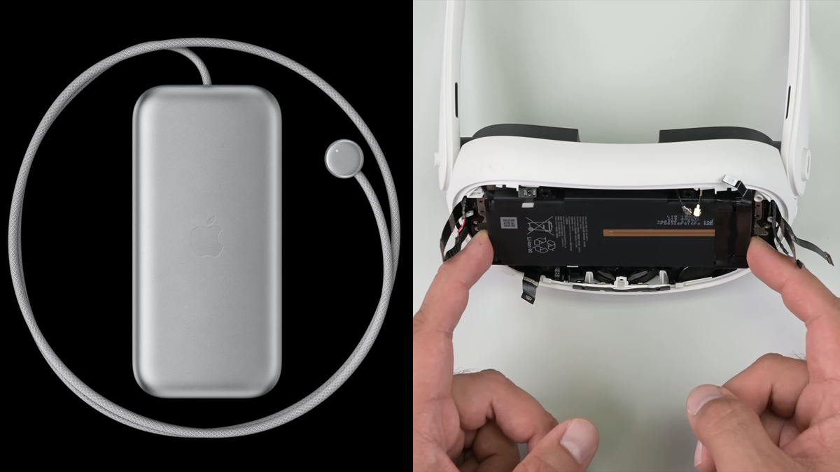
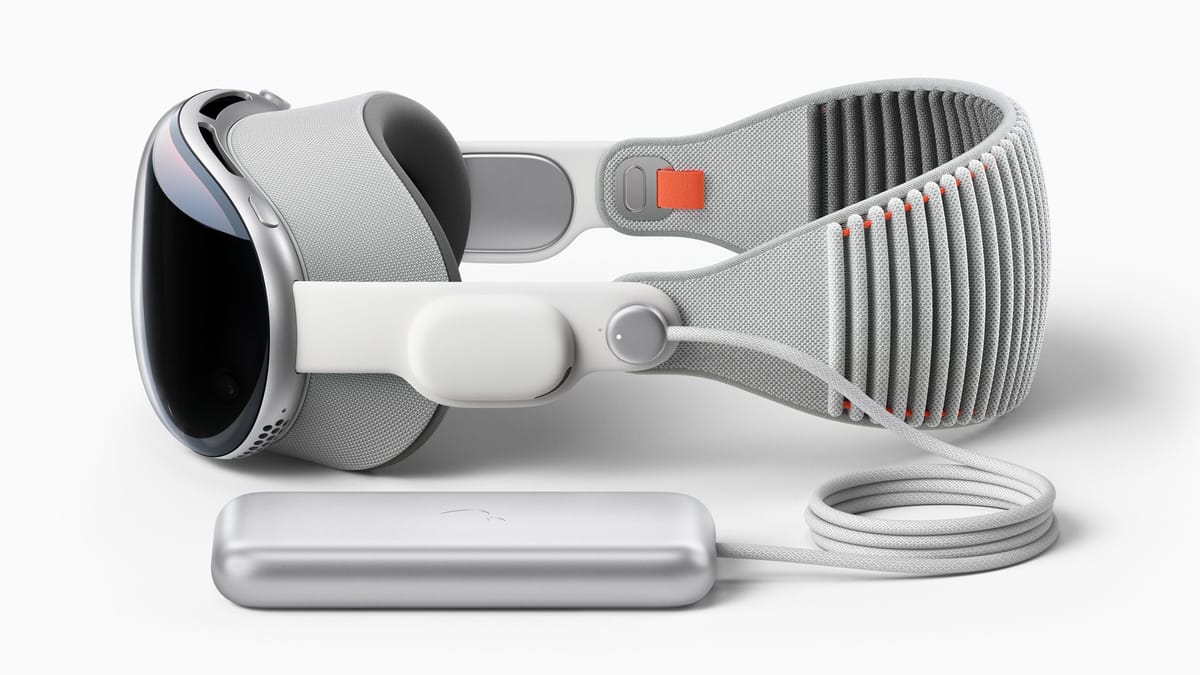
Whatever your view on this, Apple chose the tethered battery approach, at least for its first-generation headset. And that means that every time you go to use Vision Pro you have to consciously think about how to best position this 353 gram anchor, around double the weight of a typical smartphone, and how to keep the cable out of the way of your left arm. And if you want to stand up or even just adjust your seating position, you better make sure the battery is in your pocket or held it in your hand.
I’ve snagged the cable. I’ve knocked the battery off my chair, uncomfortably tugging the headset. And I’ve leaned too far to the right and hit the tether’s limit. The battery tether feels ever-present, and because it’s so short it’s much more annoying than the long tether of PC VR headsets or PlayStation VR2. I’ve picked up Quest 3 frequently in the past few days as a point of comparison to Vision Pro, and it’s incredibly refreshing being able to just put the headset on your head and move however you like, no forethought required.
Back in 2019 we asked Oculus executive Jason Rubin whether his company was considering a tethered portable compute model. He’s what he said:
“That’s a model we’ve definitely explored. There’s a lot of upsides to it, like visually having the smaller glasses on your head, big advantage. Battery, keeping the weight away, the heat away from the screen, being able to separate battery. All of that is great.
The problem is when you do it, cause we’ve tried it, you have a wire. And you don’t ever forget that wire.“
Unfortunately, Rubin was absolutely right. In my time with Apple Vision Pro so far, I have almost never forgotten that wire.
As for the actual battery life, I consistently got around the 2 hours advertised, though you can connect USB-C power to the battery for indefinite use, and this is how I spent the majority of my time in Vision Pro. Given this and the product’s seated focus, I find the popular complaints about battery life, mostly coming from those who don’t actually own the headset, to be overblown.
Sidenote: the battery seems to have an IMU in it, as lifting it or tapping it will sometimes activate the power status LED. Talk about overengineering!
Narrow Vertical Field of View & Light Seals
The very first thing I noticed when I actually put Vision Pro on my face was the field of view.
Horizontally it’s fine, and feels roughly on par with Quest 2. But vertically it’s one of the narrowest of any modern headset, noticeably narrower than any Quest.
This doesn’t much matter for watching traditional video content, as most of it is in widescreen aspect ratio anyways. But it feels somewhat claustrophobic for fully immersive content or looking around with passthrough, limits the viewability of your keyboard in productivity scenarios, and makes walking around dangerous because you can’t see the ground below. That’s reason #1 that Vision Pro can’t be practically used outdoors, and why the videos you see of people doing this are influencers chasing clout, not honestly depicting a practical use case.

Fascinatingly though, Vision Pro’s narrow field of view is actually the fault of the thickness of the light seal, otherwise known as the facial interface. You can technically wear Vision Pro without a light seal, though Apple doesn’t recommend it and it hurts your nose too much to be practical. Without the light seal, Vision Pro’s field of view feels just a few degrees narrower than Quest 3.
There are 28 different light seal sizes, in the format NumberNumberLetter, eg. 33N. The first number is the width (from 1 to 3), the second is the thickness (from 1 to 6), and the letter is the nose bridge size, either W for wide or N for narrow.
My size is 21W, meaning I have the thinnest possible light seal, yet it significantly narrows the field of view compared to not using it. I can only imagine how much worse the field of view is for those with thicker light seals.
The other strange thing about the light seal is that it doesn’t actually block out all light. And I don’t mean because of its shape like with other headsets. The seal itself is comprehensive, with only a tiny light gap, an advantage of the face scanning process to choose the ideal size. The problem is that fabric material itself is simply not fully opaque, so bright lights partially penetrate it and get through to your eyes – and the lenses, causing distracting glare. I consider this an outright design flaw. It’s also reason #2 that Vision Pro can’t be practically used outdoors, and why the videos you see of people doing this are influencers chasing clout, not honestly depicting a practical use case.
IPD Adjustment & Lens Clarity
On Vision Pro IPD adjustment is handled fully automatically. And I mean fully. When you first put it on you’re told to hold the top button, and you feel (and see a visualization of) the lenses moving horizontally to align with your eyes. The eye tracking cameras sense the positions of your pupils and tiny piezoelectric actuators move the lenses into place.
This basic idea isn’t new. Automatic IPD adjustment is also a feature of Pico 4 Enterprise, Pimax Crystal, and Varjo headsets. But Vision Pro actually goes one step further than any of these: each lens moves independently. This is important because many people’s IPDs are actually asymmetric, with a slightly different distance offset relative to the center of their face. With Vision Pro you get essentially perfect horizontal optical alignment. Of course, this would have been a much bigger deal in a world before Quest Pro and Quest 3, which have lenses with an eyebox so wide that it doesn’t really matter if your IPD is set slightly wrong.
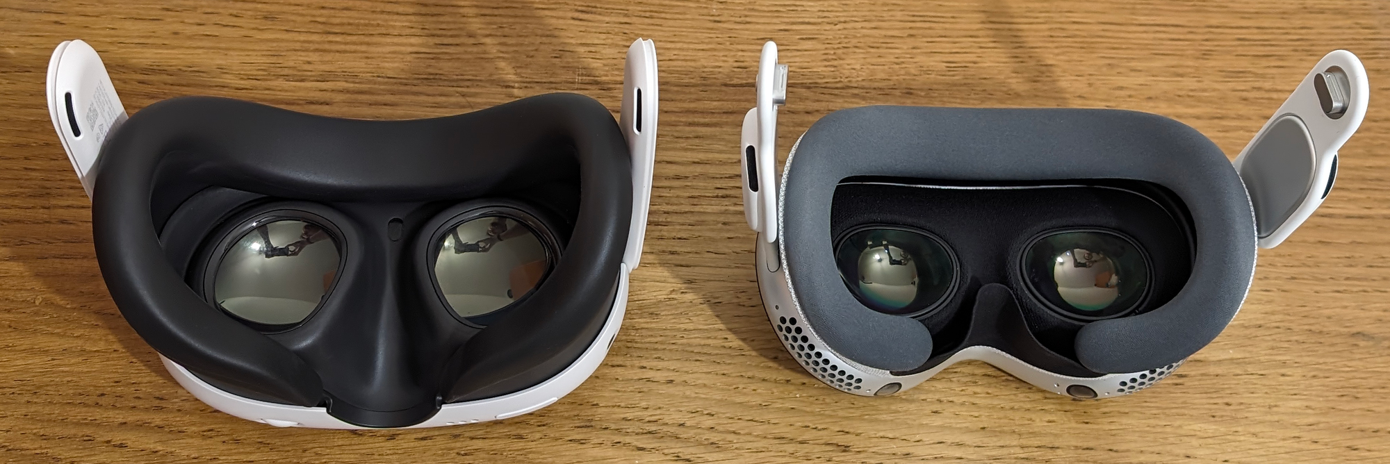
Another unique feature of Vision Pro is dynamic distortion correction. It uses eye tracking to update the lens distortion correction model in real time to account for the angle of your eye each frame. Meta has shown off prototypes of this, but Apple actually shipped it.
And as with all shipping headsets though, Vision Pro’s lenses are fixed focus, so you’re not getting realistic focus as a depth cue and objects close up are blurrier. But per-eye automatic IPD adjustment and dynamic distortion correction are still noteworthy features, and I hope both become a standard for all high-end headsets.
As for the actual optical clarity of the lenses, Apple is second only to Meta. The image is generally sharp and undistorted except for the left and right edges of each eye, roughly 5% on each side. At those edges there’s a harsh blur and color fringing much more extreme than Quest 3. This can be noticeable when using your eyes to glance at a virtual screen to your side, forcing you to turn your head.
Prescription Inserts & Glasses Support
I don’t need glasses, so I can’t comment on the feeling of using the $150 prescription inserts on Vision Pro. What I can tell you is that each insert comes with a QR-like code that Vision Pro scans to adjust the baseline of the distortion correction model. Very impressive attention to detail and quality.
While you can theoretically jam your glasses into Vision Pro as my colleague Kyle Reisenbeck tested, Apple strongly advises against doing so. You might scratch the lenses, and any distortion introduced by the glasses won’t be corrected for. The eye tracking is also not designed to be used through glasses, though Kyle claims it did work for him.
Passthrough Is A Mixed Bag
Clarity, Brightness, Colors, And Dynamic Range
Despite what you may have heard, in all but the brightest lighting conditions, Apple Vision Pro’s passthrough does not feel anything like a transparent optic. It still very much so looks like a smartphone camera feed.
Meta Quest 3 uses 4 megapixel color cameras for passthrough, while Vision Pro uses 6.5 megapixel cameras. For comparison, to achieve passthrough clarity claimed to be “practically indistinguishable from natural sight”, the PC-based Varjo XR-4 uses 20 megapixel cameras.
As with all camera systems, Vision Pro’s quality is heavily dependent on the lighting conditions. But in general, from a clarity perspective Vision Pro’s passthrough is noticeably better than Quest 3, but not dramatically. It’s slightly grainy, though much less grainy than Quest 3, and slightly blurry, though noticeably less blurry than Quest 3.
I used a miniature Snellen chart (provided by my editor Ian Hamilton) to quantify what level of human vision the passthrough on each headset can provide. With Quest 3 I could just about read the fourth row, equating to 20/50 vision, while on Apple Vision Pro I could just barely read the fifth row, equating to 20/40 vision. With no headset on, I can read the eighth row, meaning 20/20 vision.
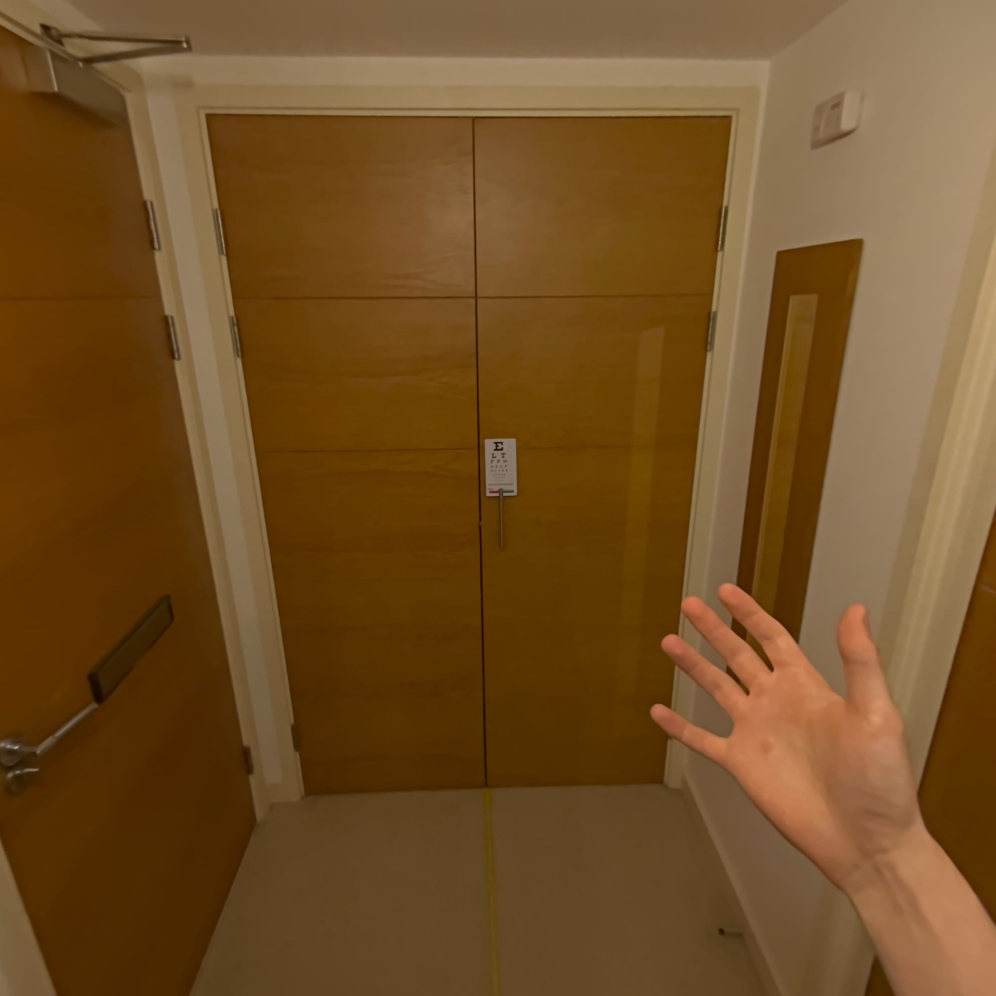
Vision Pro’s passthrough is good enough that the fixed focal distance becomes the main limiting factor for using your phone comfortably. But it’s still not good enough to see fine details such as small text at any distance beyond a meter or so, and without bright lighting it’s not even good enough to clearly see the keys of a keyboard resting on your knees.
And Vision Pro’s passthrough is actually worse than Quest 3’s in some ways. Whereas Quest 3’s passthrough is bright and vibrant, Apple Vision Pro’s is darker and has muted colors with what looks like a subtle sepia tone filter. Could this be an unintentional tradeoff of the darkened glass frontplate, or is it solvable with software tweaks?
An area where Vision Pro’s passthrough shines though is its incredible dynamic range. Sure Quest 3 will dynamically adjust its exposure when you get near a bright light source, so that for example screens are temporarily visible, but Vision Pro doesn’t have to. Its camera dynamic range is sufficient to handle a huge variance of lighting at the same time, so you get almost no blowout. It’s remarkable. Even outdoors with the sun blasting at me, Vision Pro’s passthrough was not blown out.
Scale, Depth, And Motion Blur
By far the biggest difference between passthrough on Vision Pro and Quest 3 is the fundamentally different underlying technique. This delivers the most significant advantage Vision Pro’s passthrough has over Quest 3, but it also has some serious tradeoffs.
The difficulty with passthrough as a concept is that the cameras are not positioned where your eyes are. The lenses, displays, and computing hardware create distance between them.
On Quest, the view you see of the real world is a real time reprojection of the camera view. The headset runs a computer vision algorithm on the greyscale tracking cameras to generate a per-frame first-person depth map, and the pixels from the color cameras are skewed to match this depth map, aiming to deliver a view with the correct depth and scale you would see from the position of your eyes. In the near field, Quest even uses positional tracking so that your head can translate through this reprojected view before the next camera frame is even available to minimize perceived latency. The problem with this approach is that the per-frame depth map is very low resolution and not fully accurate, which is why Quest 3’s passthrough exhibits the horrible bubble warping distortion we harshly criticized in our review, why turning off positional tracking also turns off passthrough, and why the passthrough will violently judder and skew in a moving vehicle.
It’s very obvious that Apple Vision Pro does not use this kind of real time reprojection. There is no warping of any kind, ever, even when I purposefully blocked the tracking cameras. It never thinks a glass window is a 2D image. And covering the cameras on one side of the front of the headset, which on Quest breaks the reprojection, does nothing on Vision Pro except black out one eye. But how I really know Vision Pro isn’t a dynamically reprojected view is that the scale and perspective are slightly off. Yes, that’s right, Apple Vision Pro’s passthrough is not depth-correct. This was the most surprising aspect of Vision Pro for me, and something I’ve seen almost no other review mention.

Being free of the Quest warping distortion is deeply refreshing, can feel sublime in comparison, and is probably what most people mean when they praise Vision Pro’s passthrough. And if you’re sitting on a couch where the only thing close to you is your hands, you probably won’t even notice that the view you’re seeing isn’t depth-correct. But if you’re sat at a desk, you will definitely notice how the table and monitor in front of you skews as you rotate your head, in a way that virtual objects don’t. And at these close ranges, you’ll also notice that the alignment of virtual objects with real objects is slightly off as you move your head. This isn’t because of any tracking error, it’s again, just that Vision Pro’s view of the real world isn’t depth-correct. Lift up Quest 3 and you’ll see real world objects remain in the position and scale they were at when you had the headset on. Lift up Vision Pro and you’ll see everything is slightly offset. Apple prioritized geometric stability, while Meta prioritized depth and scale at the cost of bubble warping.
That Vision Pro’s view isn’t a dynamic reprojection is also very obvious when you’re walking. Walk through your home or outdoors in Vision Pro and each step will cause the passthrough view to shake slightly, and even makes me feel a little queasy. Do the same on Quest 3 and, while you’ll see warping distortion on walls, the view you see is free of that shaking, because again, you’re moving through a reprojection, not seeing raw camera output. This is reason #3 that Vision Pro can’t be practically used outdoors, and why the videos you see of people doing this are influencers chasing clout, not honestly depicting a practical use case.
Another interesting difference between Apple and Meta’s approaches to passthrough is the resulting double imaging motion blur. On Vision Pro, moving objects like your hands exhibit no blur when your head is still, and look almost perfectly smooth. But there is significant double imaging when you rotate your head – so much so that “wow, it’s really blurry when you move your head” was the first reaction of the only person I’ve demoed Vision Pro to so far. Why this is interesting is that on Quest 3 it’s the exact opposite; moving objects like your hands exhibit significant double imaging, while rotating your head results in very little. It’s all from the same cause: on Vision Pro you’re seeing a camera feed from a different position than your eyes, while on Quest you’re seeing a view reprojected to attempt to match what your eyes would see.
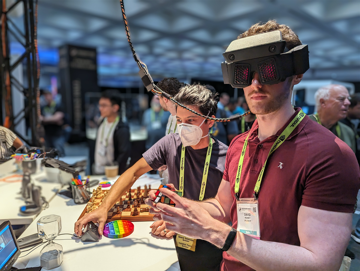
It will be fascinating to see how Apple and Meta’s different approaches evolve in future products. Theoretically, with a much higher resolution depth map, Meta should be able to minimize the tradeoffs of reprojection while keeping its advantages. Improving Vision Pro’s depth and scale on the other hand would seemingly require making the headset much slimmer and ditching EyeSight, or somehow placing the cameras underneath it, so that the cameras can be closer to the position of your eyes. Alternatively, either company might use a novel hardware-based solution such as Meta’s Flamera prototype, or implement a neural network based solution with future more powerful chipsets.
Stunning Near-4K OLED Microdisplays
What you quickly realize is that the limitations of Vision Pro’s view of the real world stem definitely from the cameras, not the displays, because the virtual content superimposed on your view is nothing short of stunning.
Vision Pro’s near-4K micro-OLED displays are the most impressive element of its hardware by far, and place its visual quality in a different league to any other competitor. It’s a breath of fresh air in a market filled with 2K LCD headsets with their murky grey blacks and muted colors.
0:00
(footage from Apple)
The colors are vibrant, the contrast and dynamic range is incredible, and there’s not a hardware pixel in sight. For the first time in any consumer headset I’ve tried, I can’t discern the hardware pixels in any scenario, and minute details are clearly visible.
It’s also the first standalone headset that has the resolution to make the productivity use cases promised by companies like Meta for years now actually viable, without needing to make the screens bigger than the headset’s field of view. At a comfortable viewing size, the legibility feels somewhere between a 1440p and 4K monitor. This is a watershed moment for VR-style headsets.
| Headset | Display Tech | Resolution Per Eye |
| Oculus Rift & HTC Vive (2016) | OLED | 1080×1200 (PenTile) |
| Valve Index (2019) | LCD | 1440×1600 |
| Meta Quest 2 (2020) | LCD | ~1680×1870 (est) |
| Meta Quest 3 (2023) | LCD | 2064×2208 |
| Bigscreen Beyond (2023) | Micro-OLED | 2560×2560 |
| Apple Vision Pro (2024) | Micro-OLED | 3660×3200 |
There is one problem with Apple Vision Pro’s displays however, the persistence, meaning the amount of time per frame the display is actually illuminated. It’s higher than almost any other headset, and this means you’ll see some motion blur when moving your head even in fully virtual content. It’s an example of how Apple Vision Pro was optimized for stationary seated use, not active movement. And it makes Vision Pro a suboptimal headset for any content where you’re rapidly rotating your head, such as the few active games.
Another smaller problem is that to drive this resolution, Vision Pro makes constant use of eye tracked foveated rendering. In native apps built with RealityKit it mostly just works, though very occasionally you’ll see minor visual artifacts in the periphery. But in some Unity apps I noticed very obvious and harsh artifacts, particularly on text. This is apparently a known issue, with fixes coming in future versions of the Unity visionOS integration.
Weight & Comfort
While Vision Pro’s resolution makes it theoretically capable replacing monitors, you probably don’t actually want to do this.
Given that much of the marketing involves sitting and watching or interacting with virtual screens for hours, and given the battery is external, you might assume Vision Pro is relatively light and comfortable. But you’d be wrong.
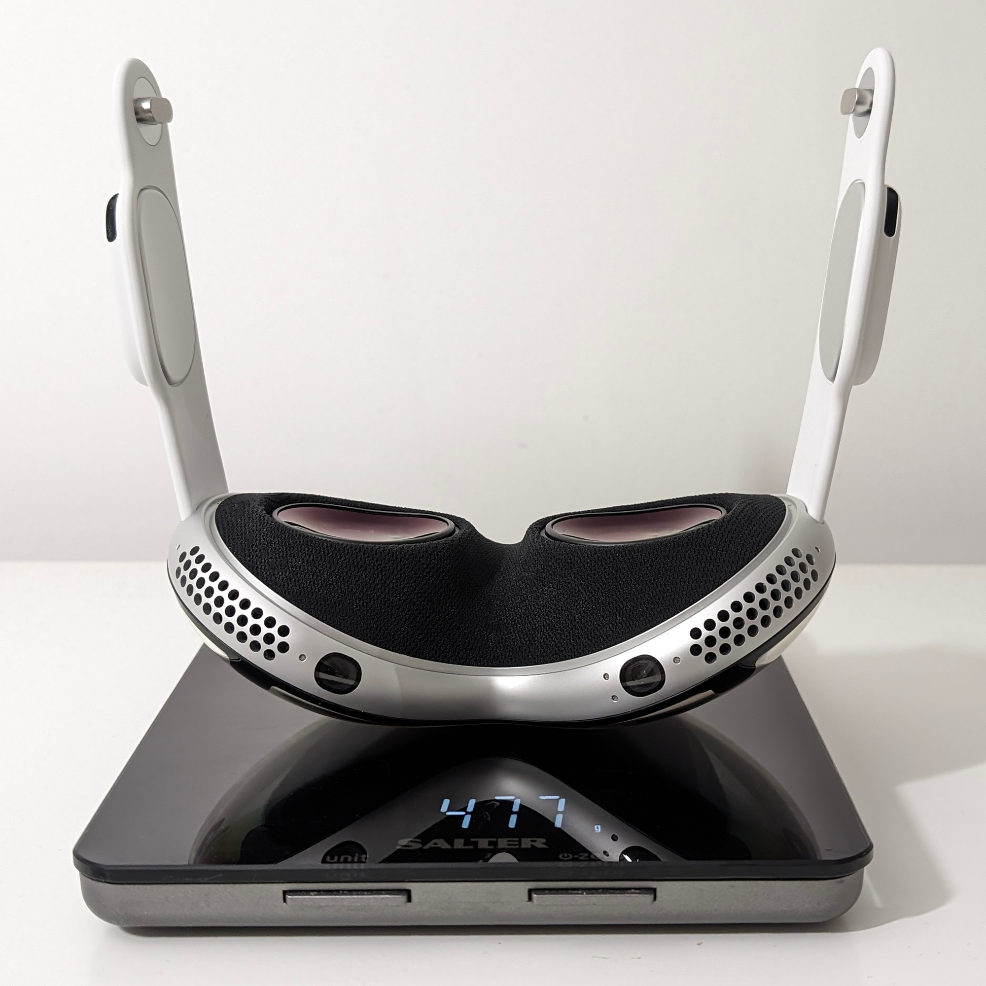
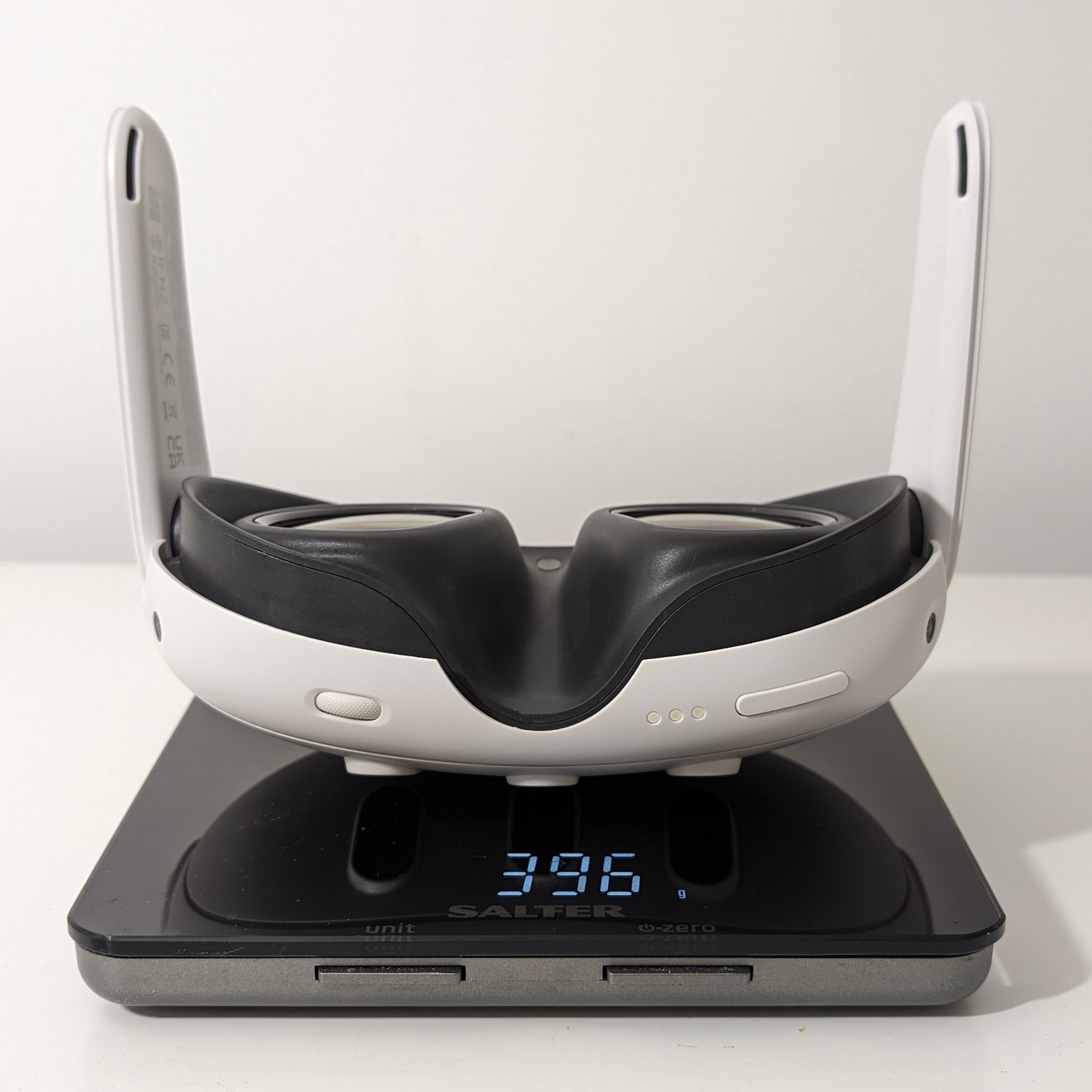
Apple Vision Pro (left) and Meta Quest 3 (right) stripped bare.
Despite its external battery design, even with the light seal and head band removed Vision Pro weighs a whopping 478 grams. For comparison, Meta Quest 3 weighs 397 grams with its facial interface and straps removed, and Pico 4’s visor weighs around 295 grams. It’s a somewhat bizarre situation that the only major headset with a tethered battery is the heaviest, but Apple has jammed a serious quantity of components in this thing and encased them in an aluminium frame with a glass frontplate. Aluminium may have been required to help dissipate the heat generated by the M2 and R1 chipsets, or is may just have been chosen for its aesthetic qualities.
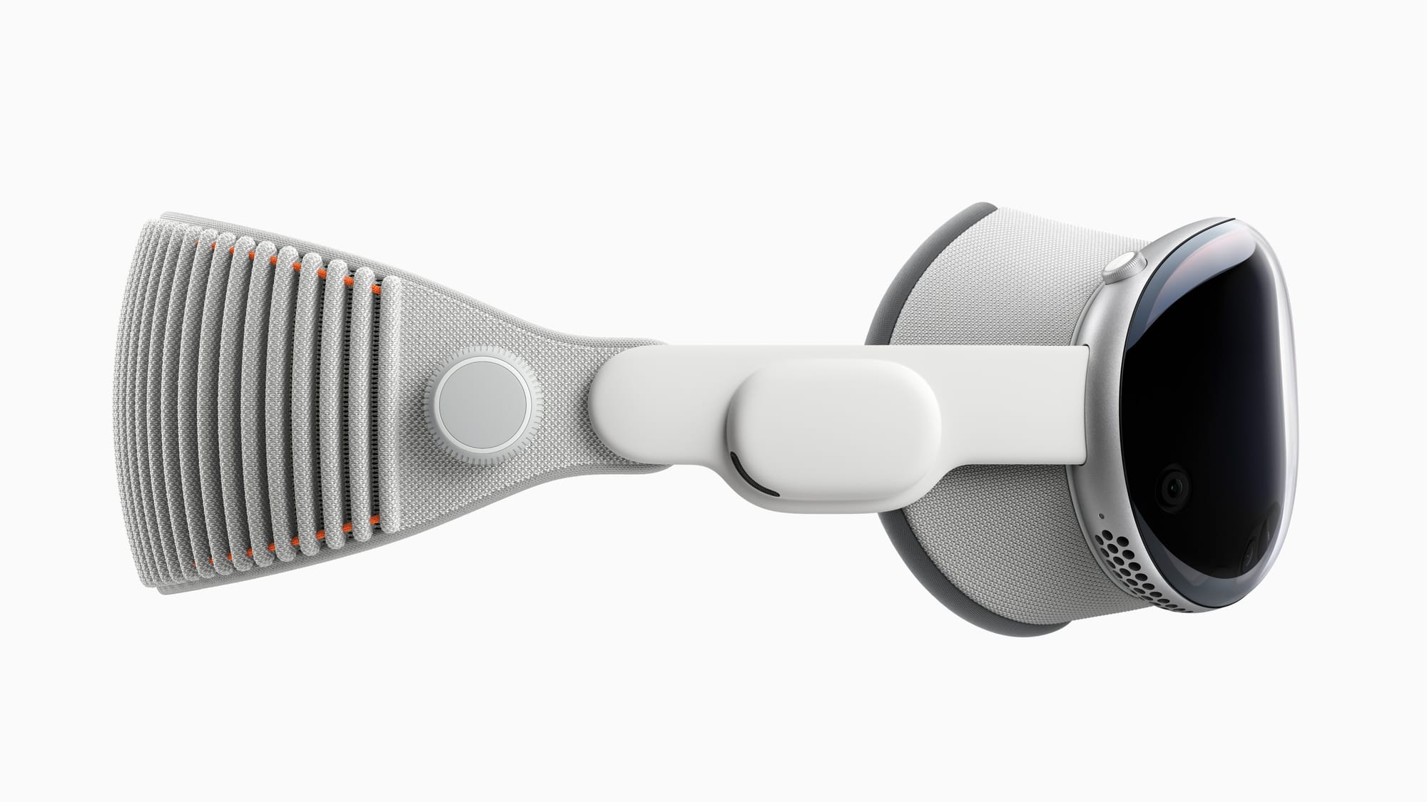
Out of the box, Vision Pro comes with a strap called the Solo Knit Band preattached. It’s the strap you see in almost all of Apple’s marketing shots, and it’s made of a “3D knitted” fabric that feels great on the back of your head. The problem though is that it lacks a top strap, a crucial component of the straps of other headsets like Quest 3 and Valve Index. The result is that the Solo Knit Band simply can’t comfortably support the weight of the headset. I find it bearable only for around 5 to 10 minutes, if even, after which the headset hurts so much I simply need to take it off. I can’t imagine Apple seriously expects anyone to wear the Solo Knit Band, and I imagine it exists for marketing shots and brand image more than any practical reasons.
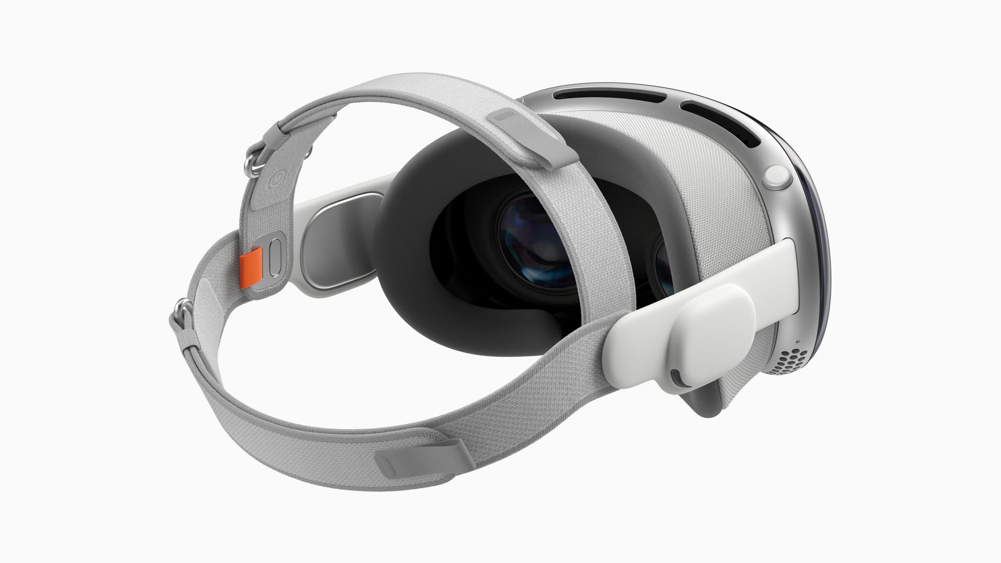
Thankfully though Vision Pro comes with a different strap in the box, called the Dual Loop Band, and it has a side-to-side top strap. With the Dual Loop Band I can wear Vision Pro indefinitely. I still wouldn’t describe it as particularly comfortable though, and the heft of the headset never really goes away.
What I don’t like about the Dual Loop Band is how its rear strap isn’t nearly as soft and pleasant feeling as the Solo Knit Band. I wish Apple had combined the Solo Knit Band with the top strap, as seen in one of its design patents.
A positive aspect of Vision Pro’s comfort is that the light seal padding is made of anvery comfortable foam, and because the light seal is sized for your face it sits very well. Yes, the weight is ever present, but at least what’s pressing against your face doesn’t feel rough like Quest 2.
Occlusion & Boundaries
It’s one thing to overlay virtual screens and objects onto the real world, but to make them convincing and usable they need to be able to be occluded by real objects. We harshly criticized Meta Quest 3’s total lack of dynamic occlusion at launch in our review of it, and though Meta recently added it, it requires complex developer integration and the depth map driving it is very low resolution, leading to pretty awful looking results.
Apple Vision Pro on the other hand has occlusion in two distinct forms.
The main form is hand and arm occlusion. There’s clearly a 2D hand and arm segmentation model (separate to the 3D skeletal hand tracking) running for each eye’s camera. How clean the segmentation is depends on the lighting conditions, but in general looks like what you get when you enable backgrounds on your webcam in an app like Zoom, or at best an amateur green screen job. This occlusion is present across the system, in every app. It’s a significant feature that makes virtual objects seem as if they’re really in the room with you. And as a polishing touch, your hand and arms get relit to match any virtual environment you’re in.
However, It’s disconcerting and jarring that this occlusion doesn’t include anything you’re holding, meaning your phone or drink will still be hidden behind virtual screens and objects, even if they should be in front. It’s as if what you’re holding is invisible.
Sidenote: I hear it’s possible for developers to disable hand and arm occlusion, but I haven’t encountered any app that does.
0:00
Vision Pro generates a high-resolution 3D environment mesh and updates it in real time. (footage from Apple)
The other form is environmental 3D occlusion. Vision Pro uses its LiDAR and computer vision to generate a 3D mesh of your surroundings which it updates in real time. This impressive capability isn’t much used yet, however. In the Shared Space, where rendering is controlled by Apple, this is only used to add a subtle transparency to virtual objects behind real geometry such as walls. App developers using a Full Space could theoretically do so much more, but none really has yet. This gap between the hardware’s capabilties and what the current software actually utilzies is a recurring theme with Apple Vision Pro.
What you won’t find on Vision Pro is the need to draw a safety boundary, as you need to on Quest 3, and you’ll never be disturbed by a giant ugly monochrome prison bar grid that draws over the app inducing depth conflict. This is a double edged sword though, because instead Vision Pro essentially permanently operates in an equivalent of Quest’s Stationary mode. Move more than a meter or so in any direction in an immersive app and it’ll gradually transition to passthrough. Apple Vision Pro lets you stand up, yes, but it does not allow full room-scale VR.
visionOS & The Shared Space
Apple Vision Pro is the first VR-style headset to ship with an operating system that isn’t just a fork of Android. While it’s based on iPadOS, which itself is based on iOS, Apple has clearly made significant underlying changes and architected the system software for spatial computing. In effect, this is the first fully featured made-for-XR operating system to actually ship powering a consumer device.
There are two fundamental “modes” of visionOS, the Shared Space and a Full Space. App developers can choose which of these modes they want to target their app for.
0:00
What The Golf, a Unity game, running on Vision Pro while Apple Messages runs alongside it. (footage from Apple)
The Shared Space is the default. As the name suggests, Shared Space apps can run alongside each other. This can include Windows, 2D rounded rectangles with optional transparency, and Volumes, cuboidal areas where apps can display 3D content, from a single model to a miniature game world. Apps can use only Windows, only Volumes, or both.
In the Shared Space Apple fully controls the rendering, lighting, and tracking. The downside is that dvelopers only receive events, such as the pixel the user was looking at when they pinch, but don’t have raw access to skeletal hand tracking. But the upsides include beautifully consistent UX between apps, a stark contrast to Quest where you have to relearn different controls and interactions between each app, even apps for simple tasks. Another advantage is that Apple uses Vision Pro’s ambient light sensors to light virtual content to match your real room’s lighting and windows and volumes even cast shadows on the real ground. None of this requires developer integration of any sort, it all happens automatically.
If an app instead uses a Full Space on the other hand, it will hide all the other Shared Space apps you had running, and you can’t bring them up without pausing the Full Space app. Full Space apps get access to skeletal rendering, and can control their own rendering stack. A Full Space is like going full screen on a PC, and using it is essentially a requirement for active gaming or immersive VR experiences.
In comparison, on other platforms like Meta Quest every 3D app effectively runs in a full space, and the concept of a shared space currently only exists for 2D apps, of which you can only have up to three visible at once. Apple’s approach allows for multitasking to include 3D apps, and this gives it significant potential as a general computing device. For example, I can watch a video or listen to my own music while playing chess in Game Room. Meta’s upcoming Augments feature for Quest 3 sounds somewhat similar, but it has yet to ship and leaked videos suggest it won’t support Unity.
One significant disadvantage of Apple’s harsh delineation of Shared Space vs Full Space though is that you can’t multitask in Full Space apps. On Quest you can bring up the browser without minimizing the immersive app, so you could be standing next to a friend in a VR game while you quickly Google something. On Vision Pro you need to return to the Shared Space, which will make the immersive app minimized and paused until you open it again.
Input & Controls
Eye & Hand Tracking
The sole biggest difference between visionOS and the system software on all the headsets that shipped before it is its radically different interaction paradigm.
In visionOS your eyes are the cursor and pinching your thumb to your index finger is the mouse click. And to be clear, you don’t need to have your hands out in front of you like you may have seen in some photos of people using Vision Pro. The whole point is that the pinch click works even with your hands rested on your lap or chair arm, meaning you can use Vision Pro for hours on end without “gorilla arm”, the term for how holding your arms up quickly fatigues them to the point of pain.
For interactions you’d perform with two hands on a touchscreen, such as zooming and rotating, you simply pinch with both hands at the same time. Pull your hands apart or together and you’ll zoom where you’re looking, or move one backwards and the other forwards to rotate.
0:00
Clicking, scrolling, zooming, and rotating. (footage from Apple)
This beautiful fusion of eye tracking and hand tracking is great for almost every interaction, and at its best can feel like telepathy, an extension of your very thoughts. It’s become so ingrained in my mind that I’ve even found myself trying to gaze and pinch at my TV and laptop screen.
However, there is one area where it fails spectacularly: text. For text entry it strains your eyes to look at each letter, and for precise text selection it just isn’t accurate enough. Sure you can direct touch the virtual keyboard, but that’s even slower. Practical text input without a physical keyboard remains an unsolved problem in XR, and Apple doesn’t have a magical solution.
Unintentional inputs are also a very real problem with hand tracking. I’ve accidentally skipped to a different part of a movie while opening a can to drink, or selected random text in a document while my hands were just resting on the keyboard. Though these occurrences mostly only happen in dim lighting, they will need to be solved in the long term to make this a viable primary input method. As it stands today, it’s analogous to a touchscreen that sometimes activates when dust particles hit it.
Further, there are some cases where you want a detachment between what you’re looking at and what you’re controlling. When seeking through a video for example I often want to look at the movie while scrolling the seek bar, and visionOS doesn’t like that. This seems solvable with a different software implementation though.
Keyboard & Mouse Support
As much as text input sucks with hand and eye tracking, you can easily connect a Bluetooth keyboard, as you can with other standalone headsets. Apple’s Magic Keyboard is even tracked, with a small text input preview above it so you can look at the keyboard while typing and see what you’re inputting.
If you plan to use Vision Pro to write in any capacity at all, even just Tweets and emails, a Bluetooth keyboard is absolutely essential. One very annoying problem is that sometimes the virtual keyboard still pops up and obscures your view. I suspect this is a bug.
0:00
So that solves the text input problem, but what about text selection? Text selection with eye tracking is just downright frustrating. You can connect Apple’s Magic Trackpad – but that’s it. There’s no mouse support yet in visionOS, which seems like a strange oversight. Ideally, I’d like to see a Magic Keyboard with a trackpad built in, as transporting both means you’re now carrying two extra things around in addition to Vision Pro, not just one.
App Launcher, Siri, And Control Center
While Vision Pro relies on eye tracking and hand tracking for most of its built-in input, it also has two physical controls on top. On the left there’s the Capture Button, and on the right the clickable dial called the Digital Crown.
My least favorite interaction in Vision Pro is the need to click the Digital Crown to the app launcher. Given how one of the main goals of Vision Pro‘s interaction system is to allow you to relax your arms and interact at the speed of thought, it’s really strange to have to reach your arm up and press a button every time you want to launch an app. I get that a gesture would restrict apps from using said gesture and occasionally fail to trigger, but imagine how much it would slow you down if the Windows start button was a physical button on the top of your monitor. I often find myself opening my palm and pinching my index finger to my thumb, the menu gesture on Meta Quest, only to remember it’s not that easy on visionOS.
In fact, it’s somehow actually faster to say, “Siri, launch
Sidenote: Siri on Vision Pro for some reason is much faster than on other Apple devices. It’s still just as limited in functionality, though.
The other kind of menu on Vision Pro, as on other Apple devices, is the Control Center. To access it you look up, with your eyes, until you see a small circle with a downwards arrow inside appear, then tap with your fingers. This is essentially a quick menu with rapid access to the time, date, light/dark environment toggle, volume control, notifications, and an expanded Control Center with quick access to Wi-Fi, Bluetooth, Airplane Mode, Travel Mode, AirPlay Casting, Mac Virtual Display, Guest Mode, Search, and Recording.
0:00
It’s an interesting alternative to a hand gesture. Essentially, it‘s an eye gesture. The problem is that it won’t show up if there’s an app in the way of where the circle should be, so you have to turn your head away from any app to spawn it. It can also be somewhat straining to rotate your eye so far up if you’re accessing it frequently. Again, I’d prefer this to be a hand gesture. And ideally, Apple should just merge the App Launcher and Control Center into one menu.
Digital Crown & Environments
Within the Shared Space, or in apps which use their own optional environment, scrolling the Digital Crown will smoothly transition between full passthrough and full immersion within the environment you choose. Halfway along, you’ll see the virtual environment in front of where you’re sitting and the real world to your sides and behind you, with a smooth translucency fade at the edges. Apple lets you choose the exact degree of immersion you want, while still letting you stay connected to as much of your surroundings as you want.
0:00
In the visionOS main menu you choose the environment you want, somewhat analogous to setting a desktop background on a Mac. Right now you can choose between:
- Haleakalā, the massive Hawain volcano
- Yosemite National Park in winter
- Joshua Tree National Park in summer
- A lakeside in front of Mount Hood
- White Sands National Park
- The surface of The Moon
All six of these environments look absolutely stunning, with the 3D geometry near you scanned in with photogrammetry that in some places approaches photorealism, and realistic high quality spatial audio. And as with passthrough, windows and 3D objects will cast realistic shadows onto the environment. It’s a stark contrast to Quest, where the environments are low resolution and blurry. That’s not the fault of Quest’s hardware by the way, as those environments have very low GPU utilization. It’s yet another example of Meta just not delivering quality software.
If you’re not a fan of shutting yourself off from the real world and mainly wanted Vision Pro as an AR headset but still want to remix your view, there are five environments that instead just relight passthrough: Morning Light, Spring Light, Summer Light, Fall Light, And Winter Light. Strangely these also come with audio, but you can independently adjust the environment audio volume.
Sidenote: before Apple Vision Pro was officially revealed, back when us reporting on the reliable sources describing it would yield “this is clickbait about vaporware!” style comments, the Digital Crown was described as the “Reality Dial”. This would have been a much cooler and more appropriate name, but I’m guessing Apple wanted branding consistency with the Apple Watch, which also has a Digital Crown.
EyeSight…
EyeSight, also known as reverse passthrough, is a clever idea. One of the biggest problems with using a headset in the same room as other people is that they don’t know when you can or can’t see them, and this triggers a primal social discomfort that many VR enthusiasts seem to underestimate.
In theory EyeSight solves this, and I applaud Apple for trying. The problem is that in its first generation form, it barely works.
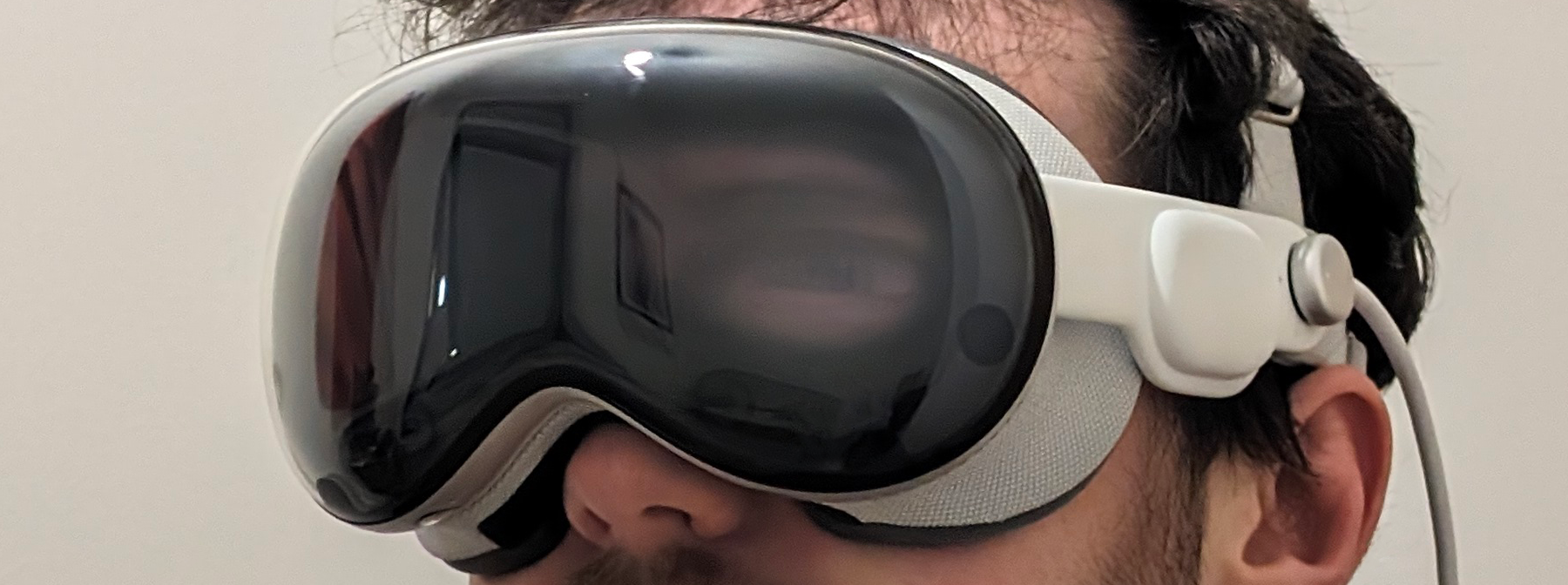
Firstly, the People Awareness algorithm that triggers EyeSight to appear in the first place has been very unreliable for me. In anything but ideal lighting, it often fails to recognize the other person and thus their answer to “can you see my eyes?” has been a solid “no, just the black glass”.
But even when People Awareness does work to trigger EyeSight, the brightness of the image is simply too dark to be useful. The answer to “can you see my eyes” has in almost every possible light condition been “barely – and I wouldn’t have noticed if you hadn’t asked”.
The final problem is that while EyeSight has parallax, this only applies to the horizontal axis. If you look at it from a steep vertical angle, from above or below, the effect breaks completely and looks even more bizarre. The responses I’ve had to this include “wow, that looks absolutely terrible”.
0:00
This Meta concept render shows what EyeSight might look like in a few generations.
Some people have written off EyeSight as a failed project, and imagine it will go the way of the TouchBar in future iterations of Vision Pro, but I disagree with this level of pessimism. Again, it’s a good idea, it’s just a very early and limited implementation. Meta first showed off research on reverse passthrough back in 2019, and recently showed a render of what it could look like on a headset “possible to build now”. While renders obviously don’t fully represent reality, Meta researchers seem confident it’s possible to deliver much higher quality reverse passthrough than Vision Pro’s, and I’m sure Apple’s engineers are already hard at work on this too.
Optimization & Performance
My single favorite thing about the experience of using Apple Vision Pro so far is the performance. No matter what you’re doing in the Shared Space, Vision Pro simply does not visibly drop frames. I haven’t experienced any judder, that horrible phenomenon that plagues Quest and PC VR and makes me and many others sick, and its absence on Vision Pro is nothing short of sublime.
It’s not exactly clear how Vision Pro pulls this off. I’ve read speculation that this is because the R1 chip handles passthrough separately, so no matter how stressed the M2 is the passthrough won’t drop frames. This sounds plausible except for one problem – if I’m in a fully virtual environments I don’t see judder either. It’s also apparent that the chipset isn’t the issue on Quest when you use a Pico 4 and see how smooth and performant its system software is. Meta isn’t hardware limited, its software is just poorly optimized.
My theory based on my dozens of hours in Vision Pro, and to be clear this is just my speculation, is that the true reason for Vision Pro’s lack of judder is something to do with the underlying architecture of visionOS. I suspect that in the Shared Space visionOS renders and composites passthrough, the virtual environment, and existing window content before giving apps any CPU or GPU time at all. So if a system thread or the app fails to complete on time, it simply pushes what’s composited already to the display. Having kernel-to-photon control over the hardware and software is somewhat useful for other categories of devices, but for XR it’s arguably essential, and allows Apple to pull off a level of polish that forkers of Android can only dream of.
Weirdly though there is one thing that appears to perform poorly on visionOS: scrolling through the app list. It seems like the animation frame rate is just low though, rather than an actual real performance issue.
Guest Mode & Sharability
When you want to demo or share Vision Pro you need to enable Guest Mode before you hand the headset over. And every time you use Guest Mode the other person will need to go through the eye tracking calibration, which takes around a minute.
It’s incredibly annoying to not be able to store the calibration in a user account. Like iPad, Apple Vision Pro does not support multiple user accounts. With iPad it’s clearly just a user-hostile decision to try to sell each family member their own, as the functionality exists in the business and education version of iPadOS. With Vision Pro there’s more of a justification given the light seal and head bands are sized for your particular face and you could argue sharing a headset wouldn’t be particularly hygienic. But it would be nice for Apple to allow couples or friends willing to buy a second light seal to have a second account. The OpticID authentication system means visionOS wouldn’t even need the added unlock step that appears on Meta Quest if you add a second account.
A very useful feature of Guest Mode though is that when enabling it you’re asked to choose an AirPlay target. If you do, the headset will start casting to it once the person puts it on. I’d love to see other headset makers add a Guest Mode that auto-starts casting and has a simplified interface. However, one annoying quirk is that you can’t watch copyrighted videos such as movies or even Apple Immersive Videos while AirPlay casting. On Quest these kinds of videos show as black on the casted view, but on Vision Pro they show as black for the headset wearer too.
Movies & TV Shows
Analysts used to speculate for years about when and how Apple would release a TV, and with Vision Pro it effectively just did. The catch of course is that only one person in the room can see it. But already today teenagers and students watch movies & shows alone in their room on a l TV, laptop, or tablet, as do single people of all ages and circumstances in their living room, and travellers in hotels and on airplanes.
The resolution, colors and contrast of the micro-OLED panels on the size of virtual screen visionOS can conjure make Vision Pro an incredible way to watch movies and TV shows. On my flight home from New York I was in an economy seat, yet I had a better movie watching setup than anyone in first class.
And while the 2D watching experience is already great, 3D content is jaw-droppingly good. This isn’t the dim, blurry, eye straining 3D you saw in cinemas or 3D TVs. This is real, perfect 3D that maintains the same vibrancy of traditional content. It’s better than 2D without any tradeoffs. I was so impressed by 3D movies on Vision Pro that it now feels like something is missing when I go back to 2D content on any platform. I could see headsets reviving this format over the next decade, as Vision Pro is already starting to do.
With no extra hardware needed, acting as a portable giant TV is what Vision Pro does best, and it makes perfect sense that so much of Apple’s marketing centers on this use case.
0:00
I’ve often heard people say “you can do this already with Quest!”, but this simply isn’t true – at least not legally. Quest has no built-in way to rent or download movies and no apps on the store offer downloading or 3D. There’s a Netflix VR app, but it requires controllers to use, doesn’t support downloads, and only streams 480p. There’s also a Peacock app, but it’s essentially just a shortcut to the website so doesn’t support downloads either. To legally download movies on Quest you have to sideload the Android phone APKs of Netflix or Amazon Prime Video from your computer. However, neither of these services has 3D content and Netflix will only stream 576p. It’s not that Quest as a piece of hardware isn’t capable of this use case, it’s that Meta simply doesn’t offer the software for it. Meta (then Facebook) had its own 3D movie rental service back in the Gear VR and Go days, but then shut it down around the launch of Quest to launch a partner app from Vudu instead. Then last year, it shut that down too. This kind of messy strategic flipflopping simply doesn’t happen in Apple’s ecosystem.
iPad Apps
The ability to download and run a huge percentage of iPad apps is one of the biggest advantages of Apple Vision Pro as a general computing device over any existing standalone headset. For example, I was able to download Slack and Trello for work, Amazon Prime Video for watching movies I already own or have access to, and Steam Link to play my PC games on an enormous virtual screen.
While it’s true that you can access many of these services via the web browser on Quest and Pico, that’s a more involved and less polished solution. Native apps still reign supreme for some use cases for all the same reasons people still use them on their phone, tablet, and even PC instead of just the browser.
Meta’s CTO said he asked Google to bring its Play Store to Quest headsets, which could have brought the vast majority of Android tablet and phone apps to Quest. But Google said no, he claimed. This may be because Google wants to keep this advantage for its own spatial computing platform it’s building for Samsung’s upcoming headset.
While it’s great to have access to them, not all iPad apps work well with the eye tracking cursor. For example, in Amazon Prime Video looking at the center of the screen highlights the rectangular touch target bounds of the invisible play button. This is so distracting that I’m shocked Apple officially promotes and recommends Prime Video, and the only workaround I could find was to use an Accessibility feature to temporarily disable eye tracking control.
The other problem is that some developers of key apps have opted out from making them available on visionOS. For example, Google opted out all of its apps including YouTube, Gmail, and Photos, while Netflix, Spotify, and Snapchat have also made their extremely popular platforms unavailable. Snapchat is an interesting example because it has a web version, but because Safari on visionOS is based on the iPad version Snap’s site will simply direct you to download the iPad app, which you cannot.
‘Spatial Computing’ & Mac Integration
I have refrained from using Apple’s description of Vision Pro as a “spatial computer” in this review. The debate around the question of what exactly constitutes a “computer” has been raging in the wider tech industry for the better part of the decade, especially after the launch of the iPad Pro, which Apple famously marketed with a “what’s a computer?” slogan.
But despite Apple’s marketing, most professionals today still choose Mac or Windows, because that’s where they find the powerful software they need. Like with iPad Pro, you won’t find XCode, Visual Studio, or Unity on Vision Pro, so you can’t use it to make apps. Nor will you find Adobe Premiere, After Effects, Photoshop, or Illustrator. What really distinguishes a “computer” from other devices in practice is the ability to professionally create, not just consume. And from a computing perspective, Vision Pro is just like having an iPad Pro with a bunch of external monitors. That’s fine if your work is entirely web-based. Anything you can do on a Chromebook you can do much better in Vision Pro. This actually includes most of my own work, and I love how well Vision Pro lets me write from my sofa or even my bed. But for more complex tasks you’ll need a real computer.
It seems theoretically possible that Apple could one day give visionOS the ability to run macOS apps. And for $3500, it really should have already. But for now, all you can do is use Vision Pro as a portable monitor for your existing Mac.
With a MacBook this process is so seamless as to seem like magic. Unlike with other standalone headsets there’s no streamer software to install, no setting to enable, and no “app” to install on the headset. You see a floating ‘Connect’ prompt above the display and by gazing at it and pinching, your MacBook screen turns off and a giant virtual screen appears above it. If you don’t see this prompt, or if you‘re using a desktop Mac, you can access this feature in control center.
The streaming quality is excellent and the latency feels lower than any wireless remote desktop I’ve ever tried. This likely stems from the advantages of Apple’s end-to-end control of the hardware and software on both devices. And the Mac display runs in the Shared Space, so you can use iPad and visionOS apps along side it.
0:00
(footage from Apple)
However, this Mac support is quite limited. It only supports one display, meaning it supports neither real nor virtual extra displays. This is somewhat amusing, given on Quest you can use Meta’s Horizon Workrooms to turn your MacBook into a triple monitor setup, with the two side monitors being entirely virtual. Ideally I’d like to be able to detach individual macOS apps from the screen and position them in space. It’ll be interesting to see how this feature evolves in future visionOS and macOS updates.
As for Windows support, that’s obviously not built in, but you can use third-party solutions on the App Store such as Steam Link or Parsec. To be clear though I’m talking about viewing a virtual monitor here, not immersive VR. Read on for more on that.
Gaming
The primary use case of Meta Quest is the biggest weakness of Apple Vision Pro.
You won’t find Superhot, Gorilla Tag, Population One, Resident Evil 4 VR, or Asgard’s Wrath 2 on here. I was surprised, and somewhat amused, to find a huge percentage of the “made for Vision Pro” games just run in a floating window, because they’re essentially just iPad games, with some occasional spatial elements. And to be clear, these are casual mobile games. While Vision Pro supports gamepads, the AAA titles that came to iPads with M-series chips like Assassin’s Creed Mirage, Death Stranding, and Resident Evil have been opted out from appearing on the visionOS App Store.
0:00
Most Vision Pro games run in a fancy window, with occasional but rare spatial elements. (footage from Apple)
There are only 5 truly spatial games on Vision Pro at time of writing, meaning games where you actually interact in three dimensions with virtual objects that aren’t contained within a rectangle or circle. Those are Synth Riders, Super Fruit Ninja, Game Room, What The Golf, and Lego Builder’s Journey.
- Synth Riders on visionOS is slightly different to the tracked controllers version on other immersive platforms, but the core gameplay is very similar. This is Apple’s Beat Saber equivalent, or at least the closest to it.
- Super Fruit Ninja is more similar to the famous mobile version than the Fruit Ninja VR series. It takes place in passthrough and you swipe fruit with your hands.
- Game Room is a streamlined tabletop simulator from the developers of Demeo, which includes Hearts, Chess, Battleship
- What The Golf is a tabletop game where you use hand gestures to fling a miniature golf ball (or sometimes club, really) through a miniature course.
- Lego Builder’s Journey is a tabletop game where you place miniature bricks to complete the build, sort of like solving a puzzle.
0:00
Game Room on Apple Vision Pro (footage from Apple)
Of these spatial games, only Synth Riders and Super Fruit Ninja involve standing up and actively moving, while the rest are slow paced and seated.
0:00
Super Fruit Ninja (footage from Apple)
What makes the active gaming experience so much worse on Vision Pro than Meta Quest is the quality of skeletal hand tracking and the lack of tracked controllers.
For some reason game developers only get a very low update-rate hand tracking skeleton to work with, making hitting blocks in Super Fruit Ninja and Synth Riders feel sluggish and unresponsive. What makes this so strange is that the system is clearly capable of much higher update-rate hand tracking, apparent when using your hands to move windows around in the Shared Space. In that context Vision Pro’s hand tracking feels superior to Quest 3, yet in games it feels significantly inferior. What’s going on here?
0:00
Synth Riders on Vision Pro (footage from Apple)
And regardless of how good the hand tracking is, the lack of tracked controllers severely limits what developers can do, and the lack of haptic feedback is very apparent. It’s just so much more satisfying to hit the blocks in Beat Saber while actually holding something and feeling each strike than it is to wave your hands in the air in Synth Riders on Vision Pro.
To summarize, Apple Vision Pro is not a headset for gamers, and if you buy it hoping to play games you will most likely be severely disappointed.
0:00
I would much, much rather play Walkabout Minigolf than this. (footage from Apple)
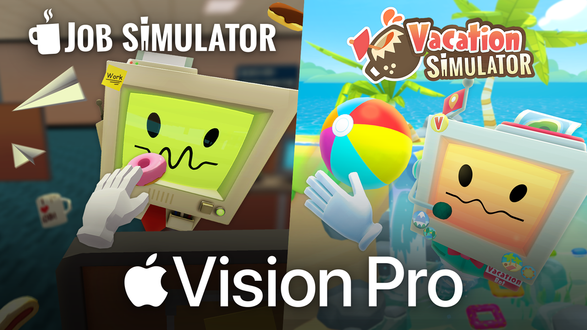
Another interesting difference between gaming on Quest and on Vision Pro is the pricing model. On Quest you mostly buy games outright, for anything from $5 to $60 depending on the title, though there is an $8/month Quest+ subscription that grants you 2 games per month that you keep as long as you stay subscribed. On Vision Pro, almost all the games so far are available through the Apple Arcade subscription service, which costs $7/month. You don’t actually own these games, you’re just renting them, though Job Simulator and Vacation Simulator are set to buck this trend.. Whether or not you prefer or hate this will depend on your own views on purchasing versus subscription.
Oh, and if you want to use Vision Pro as a SteamVR headset on Windows, you can already do that if you’re a registered Apple developer with a Mac and are comfortable with compiling the ALVR visionOS port from source.
Virtual Desktop and iVRy are working on PC VR streaming apps for the visionOS store, but those are months away at best and Apple hasn’t confirmed approval for either.
Keep in mind though that for any of these solutions, you won’t be able to play many SteamVR games by default. Most SteamVR content expects tracked controllers, and Vision Pro doesn’t include or support any. You could add SteamVR Tracking base stations and Index controllers and use a tool like OpenVR Space Calibrator to manually align them. But that equipment would cost you around $600 if you don’t own it already, and the alignment would need to be performed each time. If you’re not willing to do that, Vision Pro could still prove an excellent headset for use with untracked input devices, such as racing wheels for sim racing or HOTAS setups for flight simulators.
Apple Immersive Video
Immersive video, 180-degree or 360-degree content that partially or entirely surrounds you, has been a primary focus of VR headsets since the 2014 Samsung Gear VR and even Google Cardboard. But almost all had one thing in common: they sucked. The resolution was often bad, the 3D scale was wrong, and they almost all had horribly noticeable compression blockiness.
Through its Apple TV+ subscription service, which costs $10 month, Apple is offering immersive documentaries using ‘Apple Immersive Video’, meaning 8K 180-degree 3D video with HEVC encoding, and streaming them at high bitrates. Right now the catalog is:
- Prehistoric Planet Immersive: a series from award-winning director Jon Favreau based on his existing traditional Apple TV+ series Prehistoric Planet.
- Adventure: a series that follows extreme sports athletes on various challenges around the world. The first episode focuses on highlining.
- Wild Life: a series that brings you right next to some of the most unique animals on Earth, narrated by experts. The first episode focuses on Rhinos.
- Alicia Keys Rehearsal Room: a short documentary film offering a behind-the-scenes look at an Alicia Keys rehearsal session.
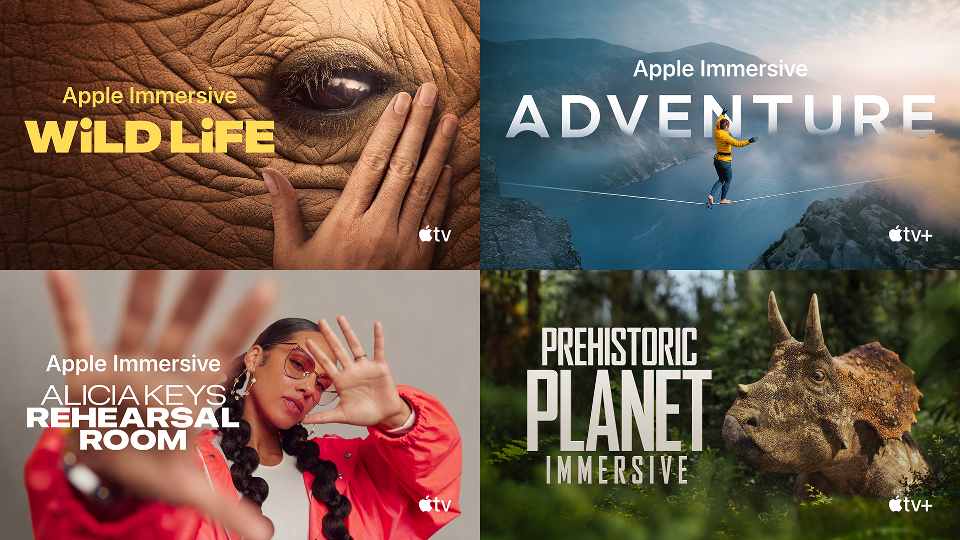
The video quality of these documentaries goes beyond any streamed 180-degree 3D video I have ever tried, and is rivaled only by predownloaded versions of Felix & Paul content on Quest. The scale is almost perfect and there’s not a compression artifact in sight. This is a stark indictment of Meta’s streaming quality on its Meta Quest TV app, which on the same Wi-Fi network looks blocky in comparison. Apple Immersive Video is so good that it has changed my view on streamed immersive video from dismissal to excitement. I can’t wait to see what other content comes along using this format. Vision Pro is also apparently capable of decoding 12K video, so the quality could get even better in future.
My only complaint with Apple Immersive Video is I wish it was at least 270-degrees, not just 180, because I often look to the sides and seeing the black bar significantly detracts from immersion.
There’s also another app offering immersive concerts from T-Pain, Zara Larson, and UPSAHL called AmazeVR. By concerts I don’t mean streams of real concerts – these are custom experiences blending 180-degree camera capture with rendered backgrounds. It’s also available on Quest and Pico, but on Vision Pro’s displays it really shines.
Spatial Videos
The other kind of video content headsets are uniquely good for viewing is regular rectangular stereoscopic 3D videos.
Apple calls stereoscopic 3D videos Spatial Video, but there’s nothing inherently special about Apple’s implementation except that it records the two views into separate streams of a HEVC file, rather than just saving it as side-by-side or over-under.
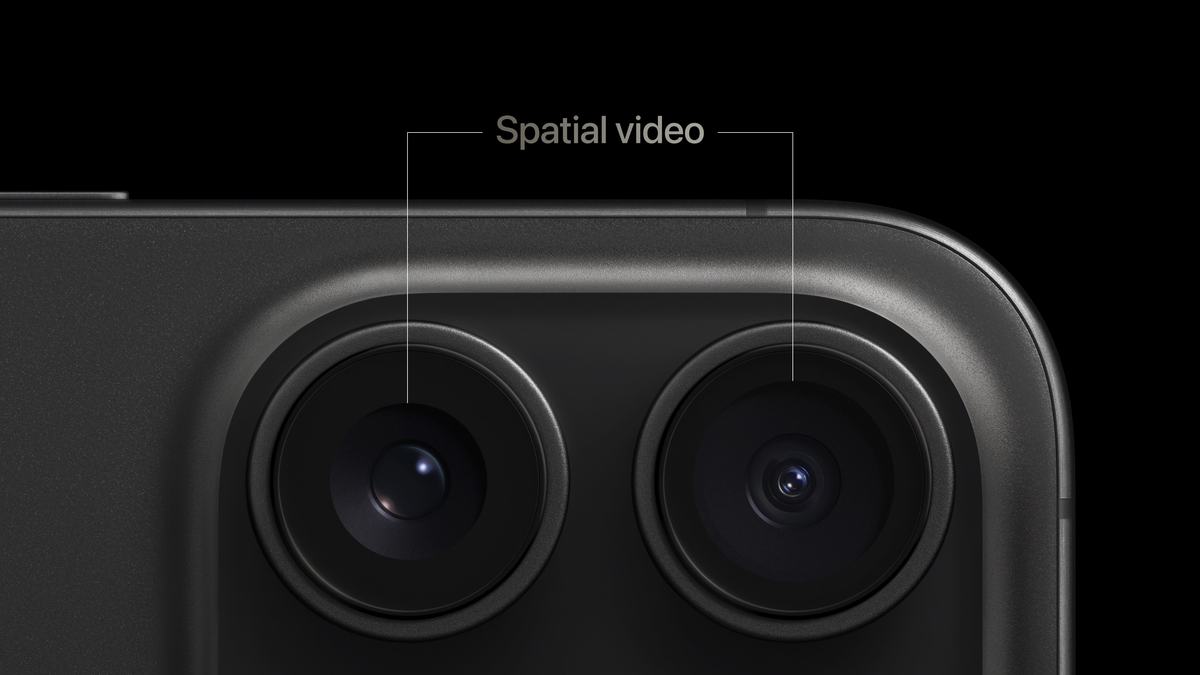
The two iPhone 15 Pro models have been able to record spatial videos since 17.2, released in beta in November and publicly in December.
Viewing iPhone-captured spatial videos could have been a headline unique feature for Apple Vision Pro, but developers stole its thunder by releasing iPhone apps allowing you to convert them to SBS 3D to watch on any existing headset, and this month Meta added the ability to easily sync iPhone spatial videos to Quest for watching. Since iPhone-captured Spatial Videos are only 1080p SDR there’s not a big difference in viewing on a $500 Quest 3 and viewing on a $3500 Vision Pro.
One thing Quest 3 can’t do however, at least not without developer command line tweaks, is record spatial videos. Apple Vision Pro isn’t just a 3D viewer, it’s a 3D camera. While iPhone captures 16:9 aspect ratio at 1920×1080, Vision Pro captures square aspect ratio 1:1 video at 2200×2200. Both are only 30FPS, which is a noticeable limitation for any kind of motion.
Personas & FaceTime
Personas are Apple’s realistic virtual avatars in visionOS. You generate your Persona by holding Vision Pro up in front of you to let it scan your face as you make different expressions, a process that takes around a minute in total.
Once generated, your Persona is driven in real time by the headset’s eye and face tracking sensors, as well as hand tracking. Your Persona will appear in any iPad or iPhone app that requests the selfie camera, as well as visionOS apps that integrate Personas such as FaceTime.
What’s really well done in FaceTime on Vision Pro is the ability to share. You can share your first person view, including passthrough, as well as files such as images and even 3D models, which the recipient can open in their space in one tap. It reminds me of how Meta is sorely missing a built-in small-scale informal hangouts app on Quest. Horizon Workrooms is too frictionful and formal and built around sharing your PC, not natively using Quest on its own.
But right now Personas on visionOS are limited to showing inside a rectangular window, as if a 3D webcam view. To me this misses out on what makes socializing in VR great: the shared coordinate space. If you’re in a social VR platform on other headsets you only see a cartoonish version of the other person, yes, but them existing in the same 3D environment as you creates a sense of social presence that’s hard to describe or even believe until you try it yourself. You can point to objects, hand someone something, or conduct group meetings in a way that just isn’t possible with the webcam grid approach that FaceTime on Apple Vision Pro emulates. And the advantages of a shared coordinate space compound the more people you have.
Thankfully, Apple is also working on ‘Spatial Personas’ that can exist outside windows enabling virtual meetups with a shared coordinate space like existing VR avatar systems. It’s one of the few updates Apple has specifically confirmed for post-launch, and I can’t wait to try it.
Okay so that’s my view on using Vision Pro to communicate with other headset wearers, but what about using your Persona to FaceTime with people in the outside world using phones or webcams? What’s great about FaceTime on Vision Pro is the view you get of the other person. You can make it big enough to match the size of their real head, a much more compelling experience than seeing them on a tiny rectangle in your hand. But what’s terrible about FaceTime on Vision Pro is the view the other person gets of you. Personas are incredibly impressive technology given how quickly they can be generated and how well they run on a standalone headset. But they remain deep in the uncanny valley, and the reactions from people you FaceTime will range from laughter to shock and disgust.
Travel Mode
While I’ve now used Vision Pro for dozens upon dozens of hours, when I first picked it up in New York I only had a couple of hours to use it in a stationary building. Just a few hours later I was boarding a flight home, where I spent around six of the eight hours wearing Vision Pro, plugged into the seat’s power outlet.
0:00
(footage from Apple)
To be able to compare the experience, I actually did the same with my Quest 3 on the flight to New York. Whenever the aircraft changed altitude, speed, or bearing all virtual elements would fly away in the opposite direction, and when there was turbulence everything would violently shake. To practically use Quest 3 on the flight I had to disable positional tracking, which also disables passthrough. Meta is working on a Travel Mode for Quest, but for now it’s a VR-only headset on flights.
Why Doesn’t Visual Inside-Out Tracking Work On Planes By Default?
People often think that markerless inside-out tracking systems on headsets, glasses, and self-tracking controllers only use the cameras, but this isn’t the case. These systems rely just as much on the inertial measurement unit (IMU), a chip that contains a tiny accelerometer and gyroscope.
While cameras typically run at 30Hz or 60Hz, the IMU typically provides updates around 1000Hz, enabling much lower latency. However, an IMU can’t actually detect absolute movement – at least not directly. The accelerometer in the IMU senses acceleration relative to gravity though, and you can take the integral of acceleration over time to get velocity. And if you again take the integral, this time of those velocity values over time, you get displacement from the original position.
This process is called dead reckoning. From moment to moment, it’s how every headset and controller tracks itself, and the optical component like cameras or laser base stations are only used to correct for the cumulative error caused by the noisyness of the IMU data. But in a moving vehicle such as an airplane, the accelerometer will pick up the acceleration of the vehicle itself, thinking it’s the headset itself moving, which results in sudden and rapid positional drifting.
Apple Vision Pro on the other hand already has a Travel Mode, and it works surprisingly well. Some industry veterans had previously declared this impossible, and yet, it works. It isn’t a 3DoF mode, positional tracking remains, though the tracking quality is worse than usual, with some minor jitter and drift.
While Apple hasn’t disclosed exactly how Travel Mode works, I suspect it makes tracking rely either fully or mostly on the cameras, with little to no input from the accelerometer in the IMU.
A hint at this explanation being true is that it warns you not to look out the window. Try this and you’ll get significant drifting, as the visual system no longer has nearby high-contrast features to use as a reference.
Conclusion, And Who Exactly Is Vision Pro For?
I’ve spent a lot of time comparing Apple Vision Pro to Meta Quest 3 in this review. I’ve done so because it’s the only comparable consumer device currently shipping. But while Vision Pro as a headset is essentially just a souped up Quest 3 – in the sense that they’re both roughly half-a-kilogram headsets with two displays magnified by pancake lenses showing you the real world through cameras – its software and content focus, battery architecture and lack of controllers make it a very different product, arguably not even a direct competitor.
Quest headsets have established a thriving XR market around the use cases of immersive gaming, fitness, and social VR platforms. Apple Vision Pro does none of these things yet, and its hardware isn’t designed to. But it does other things that Quest either can’t do at all or can’t do well enough to matter.
Back in 2005 Steve Jobs was asked by veteran tech journalist Walt Mosberg about the limitations of integrating video into the handheld form factor of an iPod. Here’s what he said:
0:00
“The fundamental problem here is that headphones are a miraculous thing. You put on a pair of headphones and you get the experience you get with a great pair of speakers.
There’s no such thing as headphones for video. There’s not something I can carry with me that I can put on and it gives me the same experience I get as when I’m watching my 50 inch plasma display at home. Until somebody invents that, you’re going to have these opposing constraints.”
I’d argue that 19 years later, Apple Vision Pro’s true purpose is to deliver on this idea of “headphones for video”. Vision Pro is a portable cinema with a bigger screen than your TV that can play 3D movies better than any TV ever could. It’s a giant monitor that fits in your backpack. Vision Pro’s current focus is turning screens into software, and it has the resolution to pull it off.
The question of course is: does it do this well enough to be worth $3500? The answer is of course not. It’s too heavy to be comfortable for many people, and it’s priced for wealthy early adopters only. But so were the first wave of cars, color TVs, personal computers, and cellular phones. There’s a reason Apple branded this product as Pro, and why so many of its press releases focus on visionOS as the product. This is the start of an entirely new product category for Apple, not just a single line, and Vision Pro is just about setting the foundations.
But I’m not reviewing the potential future Vision headset line, I’m reviewing the first generation Apple Vision Pro. Apple Vision Pro, as a piece of hardware, is simply not seven times better than Meta Quest 3. But the magic here is in the foundations of the software. For multitasking and general computing visionOS is so far ahead of the Meta Quest platform that I find it hard to imagine how Meta could ever catch up – the software differences are that stark. Without controllers Vision Pro simply doesn’t compete with Quest’s primary use cases, but it pulls off other use cases so much better. It’s a very different product.
Oh, and for what it’s worth, I wrote this entire review inside Vision Pro.


