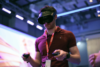
I went hands-on with Meta Quest Pro. Here are my initial impressions of Meta’s first “high-end” standalone headset:
Click here for a full spec sheet & a rundown of Quest Pro’s new features.
Visual Quality & Field Of View
The rumors were wrong: Quest Pro doesn’t have 2160×2160 panels. The resolution increase over Quest 2 is marginal, and is actually lower than Pico 4. But text and UI in Quest Pro do look sharper than Quest 2, thanks to its new pancake lenses. Every Meta headset since Oculus Go used its same fresnel lenses, including Quest 2, so this is a significant change.
Meta claims the new lenses offer 25% better sharpness in the center and 50% at the edges, and those claims match what I saw. But don’t mistake sharpness for resolution – many apps still had the same aliasing and shimmering you’ll be used to in standalone headsets.

The far more noticeable improvement in visual quality though was the contrast and colors. The combination of Mini-LED backlighting and quantum dots delivers a visual experience midway between regular LCD and OLED. These displays can much more closely approximate black than the murky greys of Quest 2 and Pico 4, and the colors are more vibrant too. Until OLED returns to standalone VR, this is the next best thing.
The rumors were also wrong about the field of view. It’s not taller than Quest 2’s, but it is noticeably wider – wider than any consumer Oculus headset, in fact.
Color Passthrough Mixed Reality
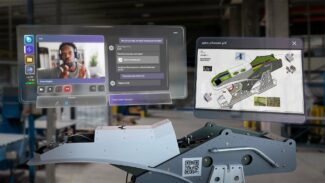
Quest Pro’s headline new feature is color passthrough for mixed reality, and it’s clearly designed around this use case.
The headset rests against your forehead so the visor seems to float in front of your face. You can see the real world above and below you, so you’re not limited to the headset field of view. But if you’re expecting the passthrough to look just like real life, you’ll be sorely disappointed.

The good news is that the headset tracking is absolutely rock solid and the passthrough is fully 3D, so virtual objects truly feel like they’re a part of the real world. When setting the controllers down in a demo with virtual tables I had to lift up the headset to check which table was actually real.
But in most of my demos the passthrough was grainy and the colors were washed out, like a video recording taken on an old phone camera. It didn’t look that much sharper than Quest 2’s, and I couldn’t read my phone or even distinctly see the keys of a laptop half a meter away.

However, for one demo I was given a headset Meta said was running a new firmware version with enhanced passthrough. In this headset the passthrough was significantly sharper. I could read text clearly and even see people in the distance clearly. The tradeoff was that it appeared to be running at a lower framerate, so this clarity was lost when moving my head.
Quest Pro’s passthrough is clearly a work in progress, and I’m very curious to find out how it turns out at launch.
Light Blockers & VR
I only got to try the side light blockers included in the box, not the Full Light Blocker sold separately for $50. The problem with the side blockers, for VR, is they don’t block out the real world below you at all. You don’t feel fully immersed in the virtual world, since you’re constantly reminded of the real world by the light streaming in from below.
I don’t understand why Meta didn’t just include the Full Light Blocker in the box instead of the side light blockers, or really what the point is of the side blockers at all. For most mixed reality apps I want to see the real world, and for virtual reality I want to be fully immersed.
The only scenarios I can think of where I’d prefer the side blockers is if I was trying to use mixed reality but bright lights in my room were reflecting in the lenses, or in mixed reality apps where a significant percentage of the room is entirely virtual.
Ergonomics & Adjustment
I’m not usually a fan of “halo strap” headsets like PSVR, Rift S, and now Quest Pro. Everyone’s head is a slightly different shape, and mine just tends to be more comfortable in headsets with a Quest 2 Elite Strap design such as the original Oculus Rift, Valve Index, and Pico 4. Halo straps tend to exert too much pressure on my forehead and eventually I get a headache.
When I first put on Quest Pro it did hurt my forehead, but with about 20 seconds of repositioning I found a fit that felt no more cumbersome than wearing a hat. And it not touching my cheeks or nose felt refreshingly freeing.
That said, it’s impossible to draw conclusions about comfort from short 5-10 minute demos. My dream is a headset I can wear for many hours as comfortably as I wear headphones, and only a full review will reveal how close Quest Pro gets to that dream.
What I don’t like about Quest Pro’s design is the eye relief adjustment wheel for adjusting how close the lenses get to your face. It’s far too stiff, so you have to hold the headset tight to move it, and it’s not obvious when you’ve moved it as close as possible.
New Controllers & Hand Tracking
The most obvious change in the Touch Pro controllers is also arguably the most important: they no longer have tracking rings. The practical advantage here is you can bring the controllers much closer together since plastic you can’t see in VR won’t bash together. This may sound trivial, but it actually opens up entirely new classes of precise hand-to-hand interactions not possible on any other headset (Pico 4‘s tracking arc is an improvement, but there are still angles they bash together).
The tracking quality felt every bit as precise as regular Touch controllers, but in one demo it took a few seconds for the controllers to align themselves relative to the headset. The controllers were moving as I moved them, but for those few seconds they weren’t in the right position. We don’t yet know how this alignment actually works, so this could just have been a pre-release software bug.

The improved haptics blew me away with the level of precision possible. It actually felt more precise – in terms of feeling like the sense of touch came from the exact part of the virtual object it should – than PlayStation VR2’s controllers, but keep in mind I’ve only had very brief demos with both so this could just be down to the particular implementation in the demo apps.
Touch Pro is actually compatible with Quest 2 and will be sold for $300 later this year. That’s a steep price, but I could see Quest 2 owners who deeply appreciate haptics upgrading to get this experience.
The controller-free hand tracking worked noticeably better than Quest 2’s. I was able to draw with my fingers in Figmin XR’s Tilt Brush experience with no interruption or glitching. It’s odd that Meta isn’t selling Quest Pro without controllers, as not all businesses or professionals will actually need them.


