As we head into 2022, the virtual and augmented reality industry is starting to look a little more competitive than it has in the last few years. But with Apple approaching the market, Meta needs to change its approach to user interface and experience in VR headsets.
Since its launch in 2019, Meta’s Quest platform has dominated the VR market. But with PSVR2 specs announced and Apple’s VR/AR headset potentially arriving as soon as this year, competition is on the rise.
Recent reports indicate that Apple and Meta are in competition over talent, both enticing their existing employees to stay while also trying to lure the competition away.
Meta is building up its AR efforts after showcasing its prototype AR project, Nazare, while also moving towards release of its Project Cambria headset later this year. Cambria is expected to feature high-resolution color passthough, eye and face tracking and much more.

Apple’s VR/AR headset is expected to focus on mixed reality using high resolution color cameras, along with a 300-400 gram weight range, dual 4K OLED microdisplays and “M1 MacBook level performance.”
While Meta has seen the most success with the Quest platform, the expected specs for Cambria and Apple’s headset would position them more in competition with each other than with the Quest.
Both companies are essentially building towards the next big leap in personal computing. As they take these next steps, it becomes increasingly important for both Meta and Apple to pair cutting-edge hardware with a seamless and intuitive user interface and experience.
Guiding the User
For Apple, this is an area of expertise. Apple is known for providing an unparalleled, seamless experience within its own ecosystem. This intuitive ‘walled garden’ approach is both chided and praised from a wider technological standpoint, but the benefit to the Apple user experience is undeniable.
Apple pairs smartly-designed, intuitive user interfaces with a notorious “it just works” attitude to new software and features, capped off by unmatched integration across its own ecosystem of devices. For most users, Apple’s software is the easiest to instantly understand — the complicated technology gets out of the way. Apple’s interfaces are designed to be used with little instruction, from either the device or other people.

On the other side of the coin, Meta offers a very different approach to user interface and experience. Despite being one of the largest social media platforms in history, Facebook is a cluttered and confusing mess of an interface. This is partly because the site’s design is constantly changed, re-designed and evolved to improve engagement. It’s a live experiment in progress, always.
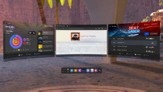
From a sales point of view, Quest 2 has been a phenomenal success and it’s now a fantastic content platform for some of VR’s biggest releases. However, the base user experience mimics the Facebook design principles of confusion, evolution and convolution.
Quest 2 runs a custom VR operating system, built around a modified version of Android. Meta has made significant improvements (both in terms of design and available features) to the OS since the original Quest launch in 2019. For dedicated users and those accustomed to advanced technology, the Quest UI does its job.
For a casual audience however, Quest 2’s interface and user experience is often clunky, unintuitive and confusing to navigate. Simple actions and features are frequently hard to find or hidden away.

This became apparent to me personally over the holiday period, while trying to help my Dad launch an app on his Quest 2. He only uses the headset once every few months, but is otherwise adept when it comes to phones, computers and other technology platforms.
What followed was a series of endless troubleshooting questions for very basic actions. “Have you found the app menu? It’s the icon with a grid of squares. It’s on the dashboard, at the bottom, can you see the dashboard? You bring it up by pressing the Oculus button. No, not that one. It’s the one that has no indentation, it’s flat, at the bottom of the face on the right controller. Can you see the dash now? Okay, can you find the app? It’s in the app menu…”
For a device that can fabricate an entire world around you, with limitless design options, it feels less natural and more confusing to navigate than almost any other platform. Meta’s UI on Quest obfuscates simple actions, over-complicates the basics and seemingly fails at guiding the user around the headset.
A Tale of Two Operating Systems
The reasons for this are somewhat clear – Meta does not have Apple’s breadth of experience in the computer platform realm. Apple have been doing this for decades, Meta just over one.
Perhaps some of the answers to these UI design problems will be solved with Meta’s proprietary VR/AR operating system, which is being developed internally and was, until recently, led by Mark Lucovsky (formerly of Microsoft, now developing an AR OS for Google).

But with Cambria releasing this year, it seems unlikely it would run Meta’s proprietary OS — a continuation of the modified Android build pioneered for Quest seems like the safer bet.
Apple’s headset will probably feature much of the same design language, features and experience that has propelled Apple to become one of the most esteemed technology companies on the planet. So if Apple’s headset releases later this year, will Cambria’s competing user experience hold up to Apple’s standard?
Apple has spent more than a decade perfecting, streaming-lining and synergizing the design of its three big operating systems: iOS, MacOS and iPad OS. The upcoming headset is rumored to run its own operating system, rOS, and job openings describe engineers working on VR/AR problems alongside Apple’s existing UI frameworks and system software teams.
Meta may have a lead in the VR/AR content war and now seems laser-focused on building its own metaverse, but Apple could easily outplay them on a system software level. How? Let’s speculate on the hypothetical user experience offered by Apple’s upcoming headset, based off the company’s existing products and ecosystem-spanning features.
The (Hypothetical) Apple Headset Experience
Like most Apple devices, the headset will probably pair automatically with your account when placed in proximity to another Apple device you own, eliminating the need for almost any user setup. This would automatically connect the headset to your existing Wi-Fi networks, Bluetooth and Apple devices, and your iCloud account.
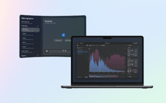
In terms of user interface, the headset will likely borrow a lot of visual and interface cues from iOS/iPad OS, adapted for mixed reality. With an Apple chip inside, native support for existing 2D iOS and MacOS apps might be possible, if not expected. If so, automatic pairing would likely sync your existing app data and files across instantly using iCloud, syncing everything inside and outside of VR perfectly.

Likewise, the headset would instantly connect to your accessories, like AirPods, right out of the box. Screenshots or video recordings taken in VR or mixed reality will probably upload automatically to iCloud, ensuring easy access from other non-VR devices. It wouldn’t be a surprise to see other Apple services, like AirDrop or AirPlay, to be integrated at launch as well.
While all of the above is hypothetical, it’s not necessarily unlikely — new Apple devices tend to fit into the ecosystem perfectly. Ecosystem features like AirDrop and automatic pairing are standard fare on every new Apple device.
Many of these features are already available on Quest, some in a different or much less convenient manner. However, the way that Apple melds intuitive design with convenient features is what counts. The average consumer doesn’t have to search very far to AirDrop a photo from one device to another — it’s just a button press or two away at all times. On Quest 2, moving a screenshot from the headset to a phone or computer is unclear and cumbersome every step of the way. For ease of use and intuitive design, it’s still apples and oranges — even when counting recent improvements on Meta’s end.
If Cambria launches with such a low standard of user experience, then Apple’s headset shipping with AirDrop and other ecosystem staples would set it up to outclass Meta in several areas almost overnight.
A Fruitful Opportunity
Meta has arguably bought and developed its way to an impressive content library and feature set, but it lacks the experience to leverage that as part of an effective, integrated platform. At launch, the opposite might be true for Apple’s headset.
Both headsets are aiming higher than a gaming market — they are the next generation of personal computing. If Meta wants to compete with Apple on that level, then it will need to adapt and make some serious changes — and soon.
Clear and intuitive user experience is becoming increasingly crucial as VR reaches a wider audience. Apple joining the fray should present the industry with some well-needed competition in this department – let’s hope Meta bites back.


