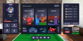
The developers of Eleven Table Tennis revealed a sneak peek at a redesigned user interface for the game’s menu system, improving the aesthetic and usability for new players.

We’ve been long time fans of Eleven Table Tennis at UploadVR and it maintained its spot as one of the best, most realistic and immersive versions of table tennis available on any VR platform. However, the UI and menu system always looked a bit subpar and didn’t quite match the polished and sublime feel of the game experience. It looks like the menu system will soon be completely overhauled and improved, as you can see in the photo embedded above.

While the old UI was functional (pictured above) it felt pretty dated compared to the UIs in some VR games. As someone who has played Eleven with my dad (who is fairly tech savvy himself but new to VR), the old UI didn’t seem to lend itself to easy navigation for new users or people who were just getting to grips with VR in general. It was difficult to explain the process of adding friends, inviting people to matches or accepting challenge invites. It looks like this new UI should fix a lot of those problems. Not only does it look much better from an aesthetic standpoint, but it also seems to improve a lot of navigation woes and should make all parts of the game much easier to access.
According to a tweet, it also seems like the new UI will bring in a new system for automatic matchmaking for ranked games, while keeping something similar to the existing system for unranked games.
Are you looking forward to Eleven’s new menu update? What do you think could be improved or changed? Discuss in the comments below or let the developers know on Twitter.


