Fracked looks a little different to most VR games.
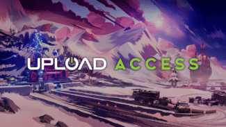
nDreams’ upcoming first-person shooter eschews realism, instead gunning for a bombastic comic book style. Snowy mountain vistas are bathed in vibrant colors, weapons are huge, chunky lego bricks and parasitic enemies are a gooey purple. It’s one of those games that really feels like it’s coming at the end of a platform generation, understanding the strengths and limitations of PSVR’s graphical capabilities and producing something striking.
It’s also, as you’ll see, incredibly close to the concept art for the game. But Fracked didn’t always look like this as we discovered speaking to Kevin Martin, Senior Principal Artist on the game about envisioning the game’s art style.
“Early concept art for Fracked was conceived in a more realistic art style,” Martin reveals. “As work on the demo progressed and we prototyped the ski gameplay and first-person shooter encounters it became obvious this wasn’t a gritty, realistic game. It was frantic, fast and fun. People would finish playing it with a smile on their face. We realised that a game like this needed an art style to match. That was a really interesting creative challenge and opportunity for the art team.”
Of course, so much VR is about realism, and convincing players they’ve stepped into another reality. Doesn’t this approach conflict with that? “VR games have some parallels with traditional first-person games where there is a rich variety of art styles on offer,” Martin continues. “This gives you some confidence that anything can work. However, the VR perspective and experience is more immersive, more like reality. Working like this makes you think about gaming as an unfolding sensory experience. As you move through the world and interact with it, what is revealed, what is around the next corner? Unconstrained by realism, how far do you want to push the visual experience.”
But, by switching up the art in the early stage, Fracked’s art team found itself in an interesting position. Usually, when you envision a game’s levels through concept art, your end product is going to look dramatically different. An Uncharted game starts out looking like an oil painting on paper and then, over the course of the next few years, turns into near-photoreal in a 3D space. Fracked, meanwhile, looks pretty much exactly like that initial work.
“There was a transition early on in production where we decided to stop reinterpreting the expressive, vibrant concept art,” Martin says. “The goal was to work like concept artists in 3D. In other words, can you make the player feel that they are running, climbing, and skiing through the concept art. We started literally painting the world, the characters and weapons in broad brush strokes.”
This approach did come with challenges, though. Martin says he had to resist the urge to add in obsessive details to the game’s environments and models, and instead rely on principle art theories. “The elements are simple but ideally, when they combine, you have the kind of art that gamers like and want to experience for themselves,” he says.
But it also has its fair share of opportunities for design. Colors are more expressive in Fracked – the purple color of enemies is reflected in areas where you can expect combat, and there’s strong use of a striking yellow that Martin says helps you read the environment for enemies, climbable surfaces, interactions and goals.
“On foot locations are strongly coloured to make the arctic landscape feel dangerous and exciting – emotions that reflect the cover shooter gameplay,” Martin says. “To punctuate the colour palettes of those on foot locations, the ski slopes are made up of epic mountains and oppressive industrial buildings – all painted in broad black and white brush strokes that you traverse through at high speed.”
Expect a bit of a visual treat for your headset, then. Fracked hits PSVR later this summer. We’ll have plenty more from the game during our Upload Access spotlight, including new gameplay footage next week and a deep dive into the game’s locomotion system. Make sure not to miss our interview with Creative Director Steve Watt, too.


