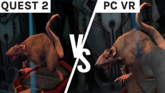
Cosmodread released yesterday on PC VR and Oculus Quest and it chilled us to our core with its eery visuals paired with incredible sound design. But, will you be equally spooked on either platform? Read on for our Cosmodread graphics comparison.
Cosmodread Graphics Comparison
I don’t quite have the same nerve of senior editor David Jagneaux, our reviewer of Cosmodread, but with squinted eyes and clenched fists I delved into a few runs on both versions of the game and was surprised at how well White Door Games kept the Quest version on par with the PC VR version. In this comparison we are looking at PC VR vs Quest 2.
Lighting & Color
First off, yes this is an incredibly dark and moody game so there isn’t going to be a drastic difference here. However, while searching dark corridors with your wrist torch you can notice a far more contrasted difference in light and dark on the PC VR version, while the Quest 2 one has a more gentle glow to it. You can see below while I’m inserting the blue key card into the door. This definitely gave me different vibes of horror – the overexposed highlights of PC VR made me scared at what horrid details I might happen across, and the dull shadows of Quest 2 kept me in a constant state of wondering if I was looking at a panel or a monster.


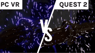
In the opening shot of the ship exploding it’s clear to see color saturation is far more intense compared to the washed out sparks emitting in the Quest 2 version. Colored glows, or blooms, also go amiss in the Quest 2 version which you’ll notice not only here but also onboard the ship with button lights, your wrist flashlight, and the control panels decorating the walls.


When looking at the gory alien tissue that’s taking over your ship, the Quest 2 version has a far more generic slimey sheen over the flesh while the PC VR version has a better placed, ‘3D’ effect working with the shadows. The color range doesn’t differ that much, but of course the modelling of the flesh is the stand-out point, bringing us to our next section.
Textures & Models
As David said in his review, the Quest 2 version has a muddied look and overall lack of definition when compared to the PC VR version.
Starting with the flesh that plagues the hallways, you can see a real lack of depth and life in the Quest 2’s scabbed over textures. It almost looks burnt or dried on, which actually made me feel a little more nauseous than the gooey, moist raised growths on PC VR.
While inspecting the walls, I almost felt like squinting – not out of fear this time, but lack of visual clarity in textures. The walls were blurred on Quest 2, whereas you can tell on PC VR that the walls have a rusted or frozen texture to them. This didn’t exactly come across in the standalone headset.


But when it comes to the difference in models there has been little degradation when bringing Cosmodread over to the standalone headset. The only instances I noticed in the above video were small details like the keycards slot – on the PC VR version there are more indentations and intricate divets, but the Quest 2 version was almost compressed in comparison. This could be due to lack of lighting on the details, but it was hard to tell.
I couldn’t find the exact same double of a lump of alien flesh I found on Quest 2 over on PC VR, of course keeping in mind this is a procedurally generated game where no two runs are the same. However, the overall quality in the chunks across both versions do differ more than anything else in the game. On Quest 2 you can see this nondescript liver-like looking piece of flesh has little to no details on it, and it didn’t pulsate upon closer inspection. But looking at the PC VR’s gruesome sack of veins and blood that still had plenty of life in it, it’s like night and day. Again, these aren’t directly comparable, but the difference in quality still stands.


Overall
This VR graphics comparison reminded me a lot of our Five Nights at Freddy‘s one, perhaps because you play in equally dark areas, or maybe because I was equally as scared to really notice any difference in graphics while in the headset. However, it’s definitely hard to ignore graphical differences when they’re side by side.
While the Quest 2 is a fantastic way to play Cosmodread, there’s no denying the PC VR version looks far more polished with sharper details, gooier gore and deliberate lighting.


